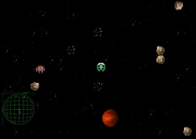
Not me…hahaha! I wish. My company is now twenty years old. That isn’t twenty straight years of indie game development with no breaks, but its twenty years of existence. Our first ‘real’ game was ‘asteroid miner’ which was released around 1998 and looked like this:

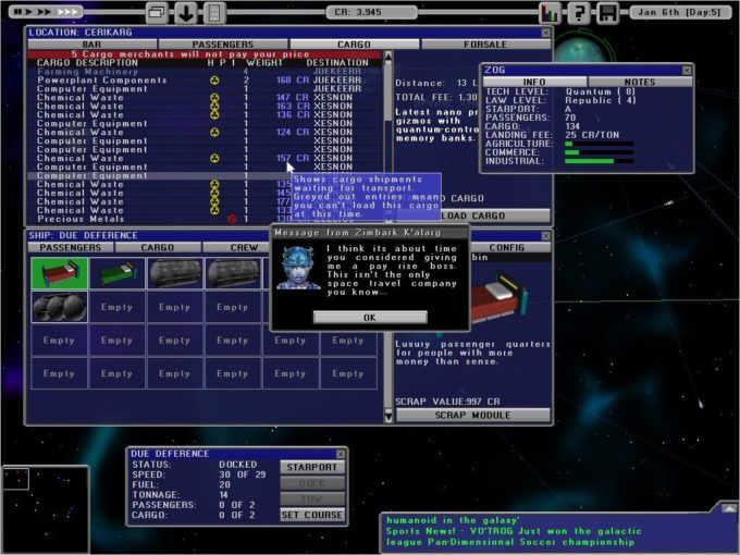
You cant even buy it now, it used directx5 and doesn’t work on many PCs. It was ok, but kinda sucky by today’s standards. Multiplayer asteroids with mining, basically. I did the art myself. Impressive huh? It sold a few copies in shareware, and then it got bundled into a collection by a retail company called egames. After that I made a game called StarLines INC, which eventually got renamed Starship Tycoon, and got revamped and improved graphics. I think I actually used some paid art for that one. it did much better, and it looked like this:

I still like the idea for the game. maybe when i retire I’ll do a re-make?
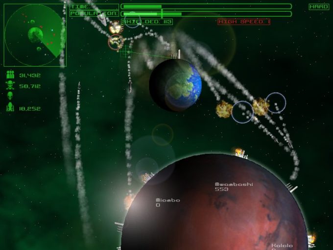
I then got distracted by doing some really bad top down racing games called Kombat Kars and Rocky racers, I even made a minesweeper clone, and some space shooty things called Space Battle 3001, and Saucer Attack. Not long after all that I think is when I ended up working at Elixir, then left there and made ‘Planetary Defense’ which looked quite reasonable:

Then I got a job at Lionhead. I think by this time I’d already made Democracy 1. I quit lionhead, and made Democracy 2, and Also Kudos and Kudos 2. These started making proper money, to the extent that I didn’t vaguely regret leaving my job. I then made Gratuitous Space Battles:
Which was a big hit, my first game on steam, my first game to earn a million dollars. Then came Gratuitous Tank Battles and GSB2, and the publishing of redshirt, my first 3rd party game. At roughly this time I made Democracy 3, which was an insane hit and also made millions of dollars, and not that long after that I think I published Big Pharma (I think this was the third million dollar selling game), then came Shadowhand and Political Animals, and Democracy 3 Africa (The first game where I employed someone to write code)
Along the way we have twice donated a chunk of earnings to war child and built two schools in Cameroon. Positech has made a profit every year and made enough to live on since Gratuitous Space Battles, which I guess is quite an unusual feat. I’ve avoided growing the company at the rate at which most people would. At one point I was developing (coding one game) managing the coding of another and publishing two others, all without any help on the admin side, and that was too much for me. Unless I was to hire a personal assistant or someone similar, I’d never be able to scale to that many games at once again.
So now in 2018 my focus is on first-party games (not publishing). We are developing one game (Production Line) and there is another game that will be announced once there is something to show. I have a full time coder working on that project. In terms of people management and time-management and project management I guess I’ve learned the following things:
1) At a certain level, time really is money. I’ll pay very high amounts of money for software or services that save me time. I’ll also not waste any time. Unless you are Gabe Newell, or someone who I KNOW is going to earn me lots of money if I talk to them, I’m never going to ‘hop on a call’ or ‘catch up’ with someone for ‘networking’ purposes. I’ll not schedule a meeting with any company whose business I haven’t already skimmed by an emailed proposal. I pay people to clean my car and my windows, because the opportunity cost of me doing is > the cost of hiring someone.
2) Dealing with people is the most stressful part of expansion or development or project management. No technical bug, hardware issue or monetary/scheduling problem is anywhere near as tricky as dealing with humans with emotions. I’m a bit ‘on the spectrum’ and not good at dealing with people anyway, let alone people I’m paying money to. I’d hire someone I could get along with with an average skillset over someone who is a pain in the ass but with l33t skillz.
3) You have to speculate to accumulate. its a cliche because its true.
4) Don’t feel bad about just saying ‘no’.
5) Some things that make money just aren’t worth the hassle to make that money. This includes porting a strategy game form PC to ipad, or…linux in any of its forms. If you prot games ‘for fun’, thats different, but I don’t.
6) Unicode is hell.
Two things I’ve managed to do that effectively grow my company but don’t require me to hire people is to invest the income, and to spend on advertising. I can double my ad budget with a mouse click, whereas doubling my games dev output requires interviewing hiring and managing another person. I know which is easiest. Over the years, Positech has invested in other indie games (in a hands-off capacity), Solar & Wind farms, tidal energy projects, a number of US tech stocks and ETFs/Funds, some commodity ETFS, UK & global equities, P2P lending to both businesses and individuals and corporate bonds. I even dabled in shorts and leveraged investments, even did some day trading of CFDs. This has gone on long enough that right now its fair to say that Positech is 80% Game Development, 20% investment vehicle. I enjoy picking stocks and shares and average 10% return per year, over the last 4 years, which is pretty good.
Its been a good twenty years so far. I’m happier as a person, and definitely calmer, and work just as hard as before. The industry has changed beyond all recognition, but its definitely possible to make a good (even great) living from indie games if you do the right things and make the right decisions and work like crazy. UK retirement age is currently 67 but probably 70 by the time I retire, so I am likely only half way there.
Yikes.