Game Design, Programming and running a one-man games business…

82% of World Of Goo players are pirates?

According to World Of Goo makers 2DBoy:

http://2dboy.com/2008/11/13/90/

And yet, despite this, I’ve been reading comments on the web where people are hurling abuse at them. These are likely from people who pirated the game anyway.

So these guys worked hard over 2 years (AFAIK) to make one of the best original indie games of the year, released it with a demo and no DRM at a good price, and then happened to mention in a comments thread once that 82% of the players stole their hard work, and yet they get insulted and abused for mentioning it.

I’m sick of the attitude of some PC Gamers. Carry on pirating if you insist, but don’t have the cheek to hurl abuse at the people you are stealing from. As usual for daring to suggest something be done about piracy, I got a load of sarcastic insults and abuse from internet trolls today too.

Seriously kids, grow up and get a job, then see how you feel when people take your work for free…

Upsell

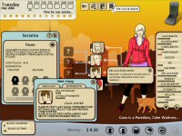
I’ve spent part of today tweaking the upsell for Kudos 2 today. The ‘Upsell’ is the efforts the demo makes to get you to buy the full copy. The original demo was pretty lacklustre in that there was a nag screen that had a default background with some screenshots from the game, and it basically said “please buy it”.

I figured I could do better than that, and in a flash of inspiration I replaced the default avatar on the upsell screen with the players actual avatar they used in the demo. Then, instead of the text saying ‘would your character have done well?” it uses their name, so it’s ‘would bill have done well?’ etc.

I also added a quote from a review of the game that was massively positive, to remind people how great the game is :D and I enclosed the upsell text in a nicer formatted white window so it looks much more polished.

Then I ditched the default, fixed screenshots and replaced them with 3 dynamic ones, where they constantly cycle through a total of 9 upsell screenshots, cross fading between them and thus adding some minor movement and animation (in some ways) to an otherwise boring upsell screen.

It won’t double conversion rates, but it can’t do any harm.

Also, I replied to an email about a potentially important deal for the game today. You have to make some pretty big guesses in my job. When people say “how much for the rights to X” you have to really stroke your chin and think about the right figure. At the end of the day, it’s a bit of a guess…

Cliffski.com

Ok call me “mr arrogant” if you like, but when someone I knew suggested I register cliffski.com, and noted it was available, I agreed and did it, hence the new blog header. Almost everyone on-line knows me as cliffski, so it’s probably worth doing. The last thing I want to do is become a megastar and find this happened.

Today has been (so far) a day of answering businessy emails and updating the website. The blog header is now a hyperlink to the newer, brighter, whiter site. It was a long time coming, but I am happy with the slightly newer look.

I got a lot of suggestions and advice for radical redesigns of the site, much of which I agree with. Some people don’t like the positech logo, and a lot of people think the layout of the main page needs changing. Plus a lot of my older web pages which I no longer link to directly haven’t been updated and are a bit crap still.

But the main thing is, the site is better this week than it was last week. Slowly but surely I make progress in such things!

I’m not writing any code right now, just doing promotion, PR and businessy stuff and negotiating various deals. It will be cool to jump heafirst into the next game, but I won’t be starting it for a few weeks. I’m mega busy with other stuff, still knackered from my holiday, and have damaged my arm somehow. Possibly through archery. I’ll get back into the swing of it soon I’m sure :D

Movie Tips from the plane trip:

Redesigning my website

Let’s be honest, the positech website is not an example of fantastically awesome web design is it? The design is by me, the humble owner/ coder/ designer/ dogsbody, so I guess I shouldn’t feel bad when comparing it against multimillion dollar company sites, but I do, and I’m trying to make it look less amateurish. here is my first attempt.

Before:

http://www.positech.co.uk/index.html

After:

http://www.positech.co.uk/newsite_index.html

Am I getting better? any suggestions or tips on how to improve it? I know it doesn’t look awesome, but I think I’m getting better at it. All feedback mega-welcome