Game Design, Programming and running a one-man games business…

Fun with 64 bit programming

So my recent adventures in the land of code have taken me to port Production Line to 64 bit. The current 32bit build only allows me to access 2 GB of RAM and although even super large factories can fit in 800MB now, when you really pack things in and put the hours in, it *is* possible to hit 2 GB. With modding & any possible post-release expansion possibilities, there is arguable a need to remove that limit and so here we are.

I’ve basically done 2 days(ish) work on it, and have a release build and debug build 64 bit version of the game that seems to run just fine. It was relatively painless. The 3rd party stuff I use is mostly, Steam, some sound middle ware, Directx and an intel profiler, and all of this has 64 bit support, so the majority of the work has been going through the config for the game and changing include folders and paths to point to 64 bit DLLs and Lib files.

This has been complicated a bit by the mess that the Visual Studio (2013) software makes out of configurations. I can have a debug64 project config that then has the platform set to 32bit, and then god-knows where the exe gets put or which files get compiled and oh-my-god how messy. I think I have finally got close to getting it straight in my head, although I have ended up hard coding exe names and paths and may have to even rename my engines lib file to engine_64.lib to make ABSOLUTELY sure that it is not using the wrong lib file and thus mix-and matching.

I can totally see why people do not want to support both 32 bit and 64 bit versions of the same game, especially given the fact that, unbeknown to me, the mere *existence* of a 32 bit dll in the exe folder will seemingly stop my 64bit .exe launching. I guess you end up with separate folders? What a pain.

In terms of code, it was almost entirely painless. As I suspected, my one pain point was my GUI code for buttons. I have a base button type that takes a function pointer called BUTTONFUNC to execute when clicked. I cannot remember far enough back to work out why, but generally I end up passing an objects ‘this’ pointer as an (int) to the constructor for a button, if I want the button function to access it as data. So I end up writing code like this:

PCheckFree = new GUI_CheckButton(TRANSLATE(“CHOOSE_MISSION_FREEPLAY”), Freeplay, (int)this);

And then in the code that receives it I’d do this:

void GUI_Scenario::Freeplay(int data)
{
GUI_Scenario* pwin = (GUI_Scenario*)data;
pwin->SetType(SIM_Scenario::FREEPLAY);
}

Which is perfectly fine and lovely, assuming pointers are 32 bit and an int is 32bit. However, it turns out that porting to 64 bit is as simple as just replacing both users of (int) with (size_t) which varies based on platform, and voila! problem sorted. I expected this to be the first step in a whole world of nightmares,, but although I have not done serious testing yet, it appears to launch, run and allow me to load in massive save games, so I reckon I’m 95% of the way there. All I need to do know is investigate how all the various stores (Humble, Kartridge, Steam, Gog) handle multiple versions (64 bit versus 32 bit), to ensure I’m not leaving the tiny 32bit minority behind. I guess eventually that will not be an issue.

I’m definitely happy that this seems to have gone smoothly, as it amounts to days of coding and admin and investigation which are essential, but doesn’t make the game noticeably better for players, which is always a worry when the game is still in Early Access. Fun fun fun…


Production Line updated to 1.61 on the steam ‘unstable’ build

Lots of cool stuff in this update to Production Line, which will get further checks, tweaks and balancing before I roll it out to the main Early Access steam branch, GoG and Humble widget customers. Here is a list of all the features, and notes on the biggies:

[version 1.61]
1) [Feature] Loans can now be re-paid early, assuming you have the funds, at a penalty of 12 hours interest.

This was widely requested, and I kept putting it off because I felt that it would lead to an unbalancing in the games difficulty, but actually now I’ve tested it for a while I think I’ve got it about right and am glad its in there.

2) [GFX] Conveyors use less obtrusive graphics
3) [GUI] New screen for market analysis to show breakdown of demand, production and sales.
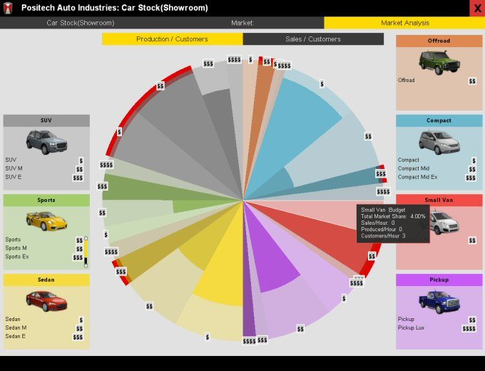
I find this new screen really helpful when playing the game towards the later stages when there is a lot to keep an eye on. I worry its not immediately obvious how it works, but I do think its a usability improvement for managing supply and demand.

4) [Content] New researchable upgrade & feature: large touchscreen.
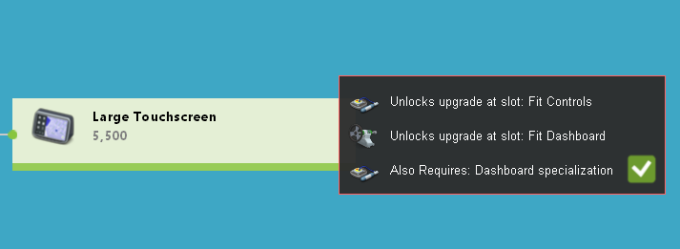
To make it obvious some cars are tesla-level expensive, and some are more Ford Ka level… :D

5) [GUI] Vehicle design screen now hides categories entirely if there is only a single default option.
6) [Bug] Fixed design research queue bugs where you could adjust first and last items up and down, causing a crash.
7) [Bug] Fixed bug where the second-nearest import bay for each stockpile was sometimes calculated wrong, meaning inefficient routing. Also major route calculation speedup.
8) [Balance] Major increases in the cost and value of electric car batteries (large and small) and touchscreens.
9) [Balance] Increased the power draw and process time for making wheels.
10) [Content] New researchable feature: parking sensors. Now a pre-requisite before reversing camera. Fitted at bumpers.

Amazing we went so far without these, as they are getting so common now. Also handy to be able to add a new feature without requiring yet another resource as ‘sensor’ is already in there. Plus it gives some much needed upgrades to the bumper slots.

11) [GUI] Revamp of the ‘apply options’ screen post-research, which adds price category indicators and selective coloring, and new buttons to apply a feature to a whole category at once.
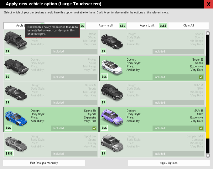
This makes things much quicker when you have 20+ designs, and you don’t really want to make a more nuanced decision other than ‘add this new widget to my expensive ranges’.

12) [GUI] Music and cruise control are now feature-categories, where the more expensive versions include the resources, value and features of the cheaper ones.
13) [Content] Self-driving! new researchable tech, new resources and feature category for high-end cars.

This is very late-game stuff and requires quite a bit of research, but then you should have expended your factory enough to have a good dozen or two dozen research facilities at this point.

14) [Balance] Boosted the impact on marketing campaigns on showroom visits by 25% to increase total market size possible with current campaigns.
15) [Bug] Fixed bug where sometimes the warning on the design screen about common or universal features missing would be skipped if the feature had a category.
16) [Bug] Fixed bug where changing the color of a car design could lead to duplicating the price slider GUI.
17) [Bug] Fixed bug where the correct price-category adjusted market value of a feature was not being displayed in a number of places.
18) [GUI] Double clicking a car in the showroom now launches the vehicle design screen for that car’s design.
19) [Content] New researchable vehicle body style -> The small van.

I’m so pleased we got this in. Its likely the last new body style,  and its a really cool one :D

Feedback on this new update is very welcome, and of course any bug reports for things I have no doubt stupidly managed to break with this patch…


Improving the charts in Production Line

Although obviously a tycoon/sim game like Production Line *does* need some fancy graphics, a decent overall design idea (‘Run your own car factory!) and a fair amount of content, in the long term, to get players to really put in the hours, the quality of the game can come down to two basic things:

  1. Is the simulation nicely balanced to provide an ongoing challenge
  2. Does the player easily have simple, clear access to all the information they need?

These are the things that I struggle with, because I know how vital they are, and yet other than measuring the games retention, they are very very hard to measure to see if you are making improvements on a day to day basis. I can easily add another car body or some more achievements or some more maps, and quantify the change, but if I redesign one of the stats screen, do I *know* that made things better?

So this results in a lot of chin-stroking and thinking, and reading books on user interface design, and of course a lot of playing the game. The screen that I have recently agonized over is this one:

Thats actually the ‘simplified version, that takes it for granted you can tell what those little $ symbols mean (price range) and recognize the car body styles enough to tell sedan from compact, from SUV etc. That frees us some space so its not impossibly text heavy, but frankly its still a mess. The red areas are ones where we are not currently selling a car to that segment, and each block is a combination of a car body style and a price bracket. All the data in each block is self explanatory (I hope), but although all the *data* is there, being able to rapidly draw conclusions from it is really hard. I guess the spread of green to red gives you a very rough approximation of how much of the market you have ‘covered’, but is that really accurate given that compacts and sedans vastly outsell offroad vehicles, and in this layout, all car body styles have equal prominence?

This is my current attempt at a solution:

This ‘pie chart within a pie chart’ shows the breakdown of total customers visits to your store (not the wider market, which is accessed through more marketing…) and shows the extent to which you produced enough cars to satisfy all those customers in each price bracket. The different body styles have been assigned colors, and those colors are split into light/dark gradients to show the four price brackets within each body style. To ensure that is apparent, icons at the edges of each segment show the price range symbols for that segment. Because the segments are correctly sized for the number of customers, its much easier to see where the majority of the market is, and no longer do you confuse the relative sizes of the off-road and sedan market (for example). It also makes it clearer that in general the expensive and luxury markets are smaller than the others. Unresearched body styles are greyed out entirely.

Here is an example with all body styles researched:

The inner chunks that are more darkly coloured are used to show the percentage of that market segment you have produced cars for. So if you get 8 customers per hour for a certain body style / p[rice combo, and you produce 4 cars of that type (of whatever designs), then that segment will be drawn ‘half full’.

So far that sounds good, but there are three problems I am yet to resolve.

  1. When you produce too many cars (produce 9 when there are only 8 customers) that information is not shown.
  2. This shows car production but not sales. maybe I produce a car for each customer, but they are too expensive to sell to them?
  3. The player may confuse the relative shaded AREA rather than the radius of the inner chunk as being the relevant metric.

Almost all of this is clarified by the mouseover tooltip which explains everything, but thats a clunky fix. I’m thinking of adding an extra red ‘bleed’ segment at the circumference to illustrate any cases where there is overproduction. I’m also considering having selectable buttons at the top to toggle between this chart showing production and then sales, as they are obviously different stats.

Still… I think its certainly a helpful addition. If you want to see the current version of this chart in action, I just uploaded a new blog video with it in today:


Optimizing Production Line app startup

Yeah I know its not long anyway…but its 2018 and on a CPU this speed, why is it not virtually instant?

I just multithreaded the steam app_init so that stuff is effectively ‘free’ now, and its time to see where the rest of the startup time is going. My current measurements from AQTime:

Drilling into this it looks like the easy wins will be inside the Main Menu constructor, as the init3d stuff probably cannot be multithreaded, and involves a lot of disk-bound stuff while I load textures, which is really tough to speed up (I could turn on my pak file code, but I’ll probably only do that just before final release).

Sadly almost all of the main menu constructor code looks like its the loading in of a big png file for my menu background. This is a 2560×1440 png file that is 7.5MB on disk. This is big, but I load in WAY more graphics than that when I do the pre-load textures on all the cars, which are in dds format. I’ll experiment with shifting it to a DDS file. This *should* be way faster, as a png has to be converted whereas a DDS file effectively *is* in the memory format used internally by directx, so its just a straight dump into memory…

That *dopes* actually drop it down to 17.2% (from 21.73%). I suspect there is a further optimisation in that this is currently not a power of two texture, so changing it to be one (as a test) yields…

OMG. its now 1.54%. Resizing that texture seems to take insane amounts of time, and this change knocks 0.5 seconds off my startup time. The next candidate is my sound engine. Multithreading its startup code completely takes it out of the picture too.

MainMenu initialise goes from 116ms to 4ms just by converting a non pow-2 png to a pow2 dds file, and now things look like this:

Total startup time has shrunk from 2.5 seconds to 1.9 seconds. Nothing anybody will consciously notice, but it makes me happier :D. Plus I *do* think that subconsciously people do feel the difference. Snappy start-up times are great for games when you want to have a quick blast, and the perceived responsiveness is bound to make people feel happier about their experience with the game. Plus it means less CPU draw and less battery drain on laptops.

This is for my car factory simulation game Production Line, currently in early access.