Game Design, Programming and running a one-man games business…

Democracy 4 comes to consoles!

Hello party members!

It is with great pleasure that we announce that Democracy 4 will be coming to Nintendo Switch, PlayStation, and Xbox consoles on 5th June 2024. With the help of our partners at Auroch Digital, Democracy 4: Console Edition has been built the from the ground-up with controller play in-mind to bring that feeling of Democracy 4 that we all know and love to home consoles.

Democracy 4: Console Edition is available to pre-order and wishlist via the following links:

Nintendo Switch – Coming Soon

PlayStation – https://store.playstation.com/en-us/product/UP5595-CUSA44561_00-0098238017880105

Xbox – https://www.xbox.com/en-US/games/store/democracy-4-console-edition/9N84BGD6VZ8K/0017

In Democracy 4: Console Edition, you will:

Choose to lead one of the following countries: USA, UK, Japan, France, Canada, Australia, Spain, Germany, Italy, or South Korea

Select cabinet ministers that align with your vision for the future of the country

Introduce new laws or tweak existing ones to carry out your plans for change

Deal with random events that can either increase or decrease your favourability with the public

Lay out your manifesto as election time approaches and aim to deliver a campaign that will take you to victory!

Auroch Digital are no strangers to porting PC titles over to home consoles, as they have done with titles such as The Colonists, Megaquarium, and Ogre, as well as developing their own titles such as Warhammer 40,000: Boltgun, Mars Horizon, and Brewmaster: Beer Brewing Simulator.

Having the chance to bring Democracy 4 to home consoles was something which intrigued the series’ creator, Cliff Harris. Cliff says: “As the developer behind Democracy 4, I’m genuinely thrilled about its upcoming release on consoles through the work of Auroch Digital. It’s been a long journey focusing on the game’s development for PC, and seeing it expand to a wider audience on consoles feels incredibly rewarding. The prospect of reaching more players and allowing them to experience the intricacies of political simulation on different platforms is both exciting and gratifying.”

Porting Democracy 4 over to home consoles is something which excites Auroch Digital’s Studio Director, Tom Rawlings. Tom says: “Bringing the game Democracy 4 to console has been a personal mission of mine – not only it is a great strategy game that deserves to have more opportunity to be played, but it is on a topic of central importance to people too. So, I was really pleased when

Positech Games were open to working together to make this happen. The team have worked hard to make it possible, so do check the game out, run a country, and try not to get assassinated!”

Democracy 4: Console Edition is available to pre-order and wishlist on PlayStation and Xbox consoles now, with the Nintendo Switch version available to pre-order and wishlist in the near future. The game will be released on 5th June 2024.

For more information visit: https://www.aurochdigital.com/democracy-4-console-edition

Speeding up my game from 59fps to 228 fps.

I recently saw a comment online that the ‘polls’ screen in Democracy 4 was horribly slow for a particular player. This worried me, because I pride myself in writing fast code, and optimizing to a low min spec. The last thing I want to hear is that my game seems to be performing badly for someone. I thus went to work on improving it. This involved about 15 mins looking at the code, about an hour musing, while trying to sleep, and about 20 mins coding the next day, plus an hour or more of testing, and profiling. Here is what I did, and how I did it.

The game in question is the latest in my series of political strategy games: Democracy 4. its a turn-based 2D icon-heavy game that often looks a lot like a super-interactive infographic. Here is the screen in question, which shows the history of the opinion polling for all of the different voter groups:
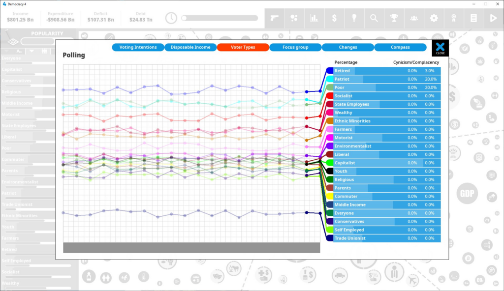
There is actually quite a lot of stuff being drawn on that screen, so I’ll explain what is going on, in ‘painters algorithm‘ terms.

Firstly, there is a background screen, containing a ton of data and icons, which is displayed in greyscale (black & white) and slightly contrast-washed out to de-emphasize it. This is non-interactive, and is there just to show that this is, effectively, just a pop-up window on top of the main UI, and you can return there by hitting the dialog close button at the top right. This is drawn really easily, because its actually a saved ‘copy’ of the backbuffer from earlier, so the whole background image is a single sprite, a quad of 2 triangles, drawn in a single draw call, filling the screen.

Secondly I draw the background for the current window, which is very simple as its basically a flat white box, with a black frame around it. This is actually 2 draw calls ( TRIANGLESTRIP for the white, LINESTRIP for the frame).

Then I draw a grid that represents the chart area, as a bunch of single-pixels lines. Thankfully, done efficiently as a single big draw call.

Then for each of the poll lines I do the following:

  • A single draw call for a bunch of thin rectangles representing the faded out lines from pre-game turns
  • A single draw call for a bunch of circular sprites representing the dots for pre-game turns
  • A single draw call for the lines from player-turns (full color)
  • A single draw call for the dots for player turns (full color)

Then a bunch of other stuff, such as the filled-progress-bar style blue bars at the right (all a single draw call) and then text on them, and then the title, the buttons at the top, and the close button.

In total, this amounts to a total number of draw calls for this screen of 102. This is almost best-case though, because its possible for that grey bar at the bottom to fill up with a ton of icons too, which would make things worse.

Now…you may well be sat there puzzled, thinking ‘but cliff, who cares? 102 draw calls is nothing? My FragMeister 9900XT+++ video pulverizer can apparently do 150,000 draw calls a millisecond’. You would be correct. But let me introduce you to the woes of a ten year old laptop, and not a bad 10 year old laptop, a pretty hefty, pretty expensive HP elitebook 8470p, which was inexplicably a gift to me from intel (thanks guys!), and came with their HD 4000 graphics chip.

I appreciate free laptops, and the intel GPA graphics debugging tools are incredible, but the horsepower of the actual GPU: not good at all. It could only manage 58fps on that screen. Assume some extra icons at the bottom, and assume a poorly-looked after laptop with some crapware running the background, and we could easily drop to 40fps. Assume a cheaper-model laptop, or one a few years older, and we suddenly have bad, noticeable ‘lag’. Yikes.

When you delve into the thrills of the intel Graphics Frame Analyzer, the problem is apparent. This chip hates lots of draw calls. It hates fill-rate too, but the draw calls seem to really annoy it, so its clear that I needed to get that number down.

The obvious stupidity is that I am drawing 21 sets of lines individually instead of as a group. There was actually method to the madness though. The lines were composed of lines AND dots, and they were being drawn differently. Each thick ‘line’ between 2 dots is actually just a flat-shaded rectangle. To do this, I create a ‘sprite’ (just a quad of 2 triangles), with the current texture set to NULL, and draw it at the right angle. Draw a whole bunch of them and you get a jagged thick ‘line’. The dots however, use an actual texture, a sprite thats a filled circle. To draw them, I need to set the current texture to be the circle texture, then draw a quad where the dot should be.
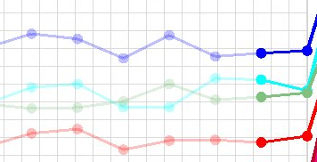
Luckily I’m not a total idiot, so I do these in groups, not individually as line/dot/line/dot. So I draw 32 lines, then I draw 32 dots, and thats 2 draw calls, one with a null texture, one with a circle texture. Actually its WORSE, because I make the mistake of treating the pre-game (simulated) turns as a separate line, because its ‘faded out’. This is actually just stupid. When you send a long list of triangles to a GPU, the color values are in the vertexes, you don’t need to swap draw calls to change colors! but hey ho.

Clearly when I wrote this code, I thought ‘well one uses a null texture, and another uses a circle texture, so this needs to be 2 separate calls’. and because I cant even make a single dotted line 1 call, no way can I make the whole thing 1 call right?

This was stupid. I could have changed my ‘circle’ texture to be 2 images, a circle, and a flat white quad, and change the UV values so that the dots used the circle, and the rectangles used the flat white quad, but there was actually an even easier method. I just had both systems use the circle texture, but set up UVs on the rectangles so that they were using only the very very center of the circle sprite, which was effectively all white anyway…

By setting those UVs, I can avoid having to use a NULL texture. An all-white texture is exactly the same thing. This way, all the lines and dots are exactly the same thing, its just a big long list of sprites, which means just a big long triangle list, which means a single draw call. And because its just 1 draw call, that means it can merge with the next line, and the next. So instead of doing 21x2x2 = 84 draw calls, I can just do one. Just one. Awesome.

Amusingly, in my actual code, I was sloppy and didnt even use the matching UVs perfectly, but it doesn’t matter:

/////////////////////////////////////////////////////////////////////////

void GUI_AnimatedGraphLine::RenderThickLines(V2* ppoints, int countpoints,
 float width, RGBACOLOR color)
{
      BaseSprite sp;
      sp.SetUV(0.49f, 0.48f, 0.51f, 0.51f);
      sp.width = width;
      sp.SetVertexColor(color);

Just making this one change made a ridiculous difference to the frame rate for this screen, sending it from 89fps to 228 fps, a completely huge win. It will be in the next update to the game.

Its absolutely not the final word on speeding up that part of the UI though. I have some very un-optimised nonsense in there to be honest. Those last little lines at the right of the chart, that connect the plotted lines to their matching text bars…. those are done as a draw call separate from the main graph. Why? Simplicity of code layout I guess. There is also a LOT of wasted CPU stuff going on. The position of all those lines and dots is calculated every frame, despite the fact that this window is not draggable or resizable, and they never change. I am 99% sure the game is always GPU bound on screens like this, so I haven’t bothered looking into it, but its still a waste.

According to the GPA Frame analyzer, the BIG waste of time in this screen is definitely the fact that I have massive overdraw going on with this whole dialog box. The window is a perfect, simple rectangle, so its easy to work out how much fill-rate was wasted drawing that background image behind it. There is zero opacity, so it would actually be fine to cookie-cutter out the top, bottom, left and right of this screen and then only draw the sections of the background image I needed. That could boost the FPS even more.

In practice though, we always have to strike a balance between code readability and simplicity, and the target of fast code. I could probably code all sorts of complex kludges that speed up the code but cause legibility hell. Arguably, I have made my code more confusing already, because there is no simple bit of code where ‘the dotted line for this group gets drawn’. There is code that copies some data into a vertex buffer…and then you have to trust I remember to actually draw it later in the screen…

Luckily I’m the only person looking at this code, so I don’t need to debate/explain myself to anybody else on this one. I’ll take happy players of old laptops over some minor inconvenience regarding following the code by me later.

I’m always surprised by how seemingly simple code can be slow on some GPUs. Whats your experience of hardware like this? Do you have an HD4000 intel GPU? Whats it like for games in your experience?

New expansion coming for Democracy 4

I’ve been working on this a while, but today I made the DLC page public, so I should now tell everyone about it :D. I’m working on a new expansion pack for Democracy 4, coming real soon now. here is the blurb:

Democracy 4 – Event pack adds 45 new events to the game.

Some of the new events act as warning signals. Maybe your push for more technology is going to lead to sudden unemployment as AI replaces jobs? Is pollution is now so bad that schools are warning children not to play outside? A famous celebrity getting car-jacked in broad daylight is a sign that crime is out of control! Other events may shake things up when you thought they were under control, such a sinking oil tanker, a collapse of the power grid or staggeringly cold winters. If you are fortunate, some random events may change your country for the better, such as a super-productive harvest, medical breakthrough or a breakthrough in trade talks.

Give Democracy 4 a boost with these extra events to liven up the game. Will you still be able to maintain control of the country, and command the respect of the voters? or will your term in office be derailed by the tragic course of events!

…so thats the blurb. Still testing right now, but hopefully releasing at the end of this month. I updated the DLC page here.

Democracy 4’s overcomplexity is by design

When I first started to make games back in the middle ages, there was very little in the way of academic discussion regarding how to do it. All existing games were designed by people who were pioneers, just ‘winging it’ and putting stuff into a game because it was ‘cool’. That child-like excitement and enthusiasm lasted a long time, but eventually the video games industry got large enough that companies needed more design staff, and people had to start teaching game design in schools, colleges and universities.

Academia has its own language, and its own way of doing things. Personally, I hate academic language. I often find that reading academic papers on a topic is 5% information and 95% display of how clever the author wants people to think they are. There is a lot of inherent snobbery in language, where people think that discussing concepts in an academic tone makes them appear cleverer than they are.

This is backwards.

It takes skill to explain a complex topic in simple language. Its also way, way more helpful. Its 2023 now, and we live in a hyper-connected world, and very much a multilingual one. A non trivial percentage of people reading this bog post will not have English as their first language. If I try and show off my vocabulary, I would impress hardly anyone, and infuriate almost everyone. Simple language is good.

I think a lot of modern game design discussion is over academic. It gets obsessed with ‘player verbs’ and ‘tight loops’ and ‘core design pillars’. That sort of language looks good in a game design document that you can show to your boss at a performance review to make them pay you more. I’m sure it has its place. However, I think this obsession with the academic analysis of video games is often destructive as it actually kills off the freewheeling experimental ‘lets just try this’ attitude which often leads to the most interesting game designs.

My most famous game is the Democracy series, of which Democracy 4 is the latest incarnation. Its a political strategy game where the player runs the country. Its 2D and icon-based, and looks like a giant super-complex and uber-connected infographic that the player navigates. The main UI screen for the game is a symphony of information-overload and looks like this:

I suspect anyone who was submitting this screenshot as a mock-up in a game design course at a university would get a D minus. Its clearly overcomplex. It puts too much burden on the player to identify whats important. Its messy, its confusing, it has too much data in one place. Try harder next time.

Except…that is the whole point. Overcomplexity is a feature, not a bug in Democracy 4. This is something that a few reviewers, and a few players do not get, and I understand why. Modern game design has been sanitized and simplified to the extreme. The player is treated often like an idiot, with the information-processing capability of a puppy. We never give the player too much choice, or too much information at any point. That would be BAD game design, that needs ‘reworking to streamline the UX’.

God I hate ‘streamlining’.

Whenever big tech companies like google or Microsoft talk about how their new UI is ‘more streamlined’. it inevitably means ‘its way worse, but it looks simpler’. Whoever thought that we should start hiding scrollbars until you go hunting for them should be sentenced to life imprisonment. There seems to be some belief among UX designers that options and information are things that cause infectious disease, and need to be hidden away whenever possible.

Anyway… thats not actually my point.

Sometimes, a game is deliberately BAD by a conventional metric, because its trying to create an atmosphere. Thats intentional. Thats something all forms of entertainment or art does, at least if the creator has a vision for what they are doing. The Omaha beach level in the original ‘Medal of Honor’ game was catastrophically hard. Like mega-hard. Insane hard. You try at least a dozen times before you even make it to the first ditch hard. THATS THE POINT. If your game is representing something incredibly difficult, it needs to BE difficult. Being scared of triggering any ‘negative’ emotion in the audience makes for incredibly sanitized, tedious, unchallenging, and unrewarding art.

Running an entire country is nightmareishly complicated. Being President or Prime Minister is shockingly complex. Just imagine how many different topics you need to be familiar with in order to make the right decisions to run an entire country. Its insane. There is good reason that being US President seems to create accelerated aging. The amount of information presented to a President in just an hour is ridiculous, in 4 years its nuts. And ALL of it is absolutely vital. You don’t get to put a document in front of a US president unless its absolutely important and probably urgent.

The best thing you can do with any game design, or any book, or movie, or music is to generate emotion. If we want information, we will read/watch non-fiction. We open ourselves up to entertainment because we want to be moved emotionally into some state. That might be fear, in a horror game, or a sense of calm flow in a factory game, or a sense of excitement and adrenaline in an FPS. This is the ‘core design pillar’ if you must use such a term. The game must generate some feeling in the player.

I know some people dislike Democracy 4 because the icon-based gameplay is not what they expect. They expect to have a 3D avatar of the president (These tend to be US players who only want to be the USA…) that walks around a 3D oval office and see animated soldiers saluting to them etc… But to me, thats not what being a president is about.

Ultimately the only thing that makes a president good or bad, is what decisions did they take? and did they make the country better? Speeches are great, having charisma is nice, being good at shaking hands or tweeting is all good, but what really matters is what did they do. Given the situation, how did they act? and why?

This is what I try to convey in Democracy 4. You are the president and you have a LOT of things to pay attention to, and YES it s overwhelming, and NO you do not have enough time/bandwidth to process all this, and you need to actually go with your gut and make emotional rather than analytical decisions very often because there simply is TOO MUCH data, so you have to play the game in a different way to most strategy games you have played. There are just too many variables, and too many equations and too much data. Thats the WHOLE POINT.

With anything interesting, you are going to lose some part of the audience. I definitely lose players, and generate refunds among some, because they find the game ‘not fun’ and ‘over-complex’. Thats to be expected. I suspect I gain more players than I lose, because this experience is not on offer anywhere else. Other game designers would simplify, or streamline the game. They would try and ‘guide the player gradually through a tightly constrained path of easy decisions’. I will not do that, because its not the vision I have for the game.

You can make your game too hard, or too fast, or too weird, or confusing. Its all ok. As long as you have a vision for what you want the player to feel, and you deliver on the promise and generate that feeling then everything is cool. Sometimes its ok for the player to feel overwhelmed, or confused, or freaked-out. Sometimes thats EXACTLY what its all about.

Democracy 4 is not too complex. Neither is Dwarf Fortress. Dark Souls is not too hard. Surgeon Simulator’s control scheme is not too fiddly. Agatha Christie is not too formulaic. Star Trek doesnt have too much technobabble. Its all absolutely fine.

Democracy 4 is on steam, epic store, gog, humble store and itch.

Using Democracy 4 to teach politics and economics

I’ve been selling educational site licenses for the Democracy series of games pretty much since I started making them, after people who taught politics started to contact me. I’ve always been very proud of the fact that a long list of educational establishments around the world have been using the game to teach so many people. It feels like a sort of vindication of the game’s design that teaching professionals think its accurate and reliable enough, that they will use it in education.

I have to admit, that I don’t really put that much effort into promoting the game as an educational tool. I have made a few attempts to do so in the past, but I found it quite frustrating to make any progress. It reminds me a lot of the sort of bureaucracy that I have experienced in trying to build a solar farm. The amount of paperwork, accreditation, form-filling and documentation required to sell educational software is enough to put me off.

Its ironic that teaching establishments, which should ideally be very future-focused (after all, you are teaching people at the start of what could be very long lives), are in fact incredibly slow when it comes to adopting new things. The minute you add a ton of bureaucracy or process to a system, you make adopting new technology or ideas more trouble than it is worth, especially if there is no pressure on the people responsible to update their teaching methods.

When I studied at the London School of Economics, it was a very dry, and very boring process. The cutting edge technology at the time was for students to place their own mini tape recorders or dictaphones at the foot of a stage where an extremely bored tenured professor would drone on about IS/LM curves until we all fell asleep. Lectures were not put online, for the very simple reason that there was no online yet.

I find economics, and Politics to be fascinating topics, but the way they were taught in the early 1990s was far from exciting or interesting. The topics were presented mostly as maths, and mostly as equations drawn literally in chalk on a board. There was no excitement, no attempt to make the subject matter appealling, interesting or memorable.

This is something that modern teachers like Scott Galloway are doing a lot to change. Its perfectly possible to make subjects exciting, interesting, even hilarious. I would LOVE to trade in my education back then, for learning science and business from scott galloway’s youtube videos, or veritasium and similar science channels. Youtube is the new lecture theater, and its way, way better.

Democracy 4 takes all this a stage further, because not only does the game present the topics of politics and economics in a much more accessible way than a textbook, its interactive. Its one thing to read a dry textbook description of hyperinflation, or sovereign debt crisis throughout history, but its another thing (and I suspect far more memorable), to experience them as disastrous events in a computer game you are playing, as they upset and derail all your plans for your country!

In general, its far better to learn things in a multi-sensory and personal way, than to have facts book-splained to you in a dry and academic environment. Interactive learning is orders-of-magnitude better than just expecting people to read dry descriptions and memorize theories and principles purely because they might come up in an exam, and that might have some impact on some future job interview that you might reluctantly apply for…

I didn’t set out to make edutainment, and I would definitely not describe Democracy 4 as an educational game. Its a game about a topic that is often taught in schools, and its as accurate as I can make it, while still being fun. I absolutely believe that this is the best way to about creating software that can be used in schools. Make something interesting and entertaining and fun, and then also make it accurate where it matters, and that way students will WANT to engage with it, and will take a real interest.

One of the most boring topics in economics is interest rates. What makes it worse is that a HUGE swathe of macroeconomic theory is about interest rates. I studied it for year and still found it boring. However, when you wrap the topic up in a video game where government debt interest becomes a variable that the player has to keep an eye on, in order to ‘win’, the topic suddenly becomes much more interesting.

I suspect we are heading towards a future where physics lessons are more like playing kerbal space program, where art classes are like using VR sculpting tools, where astronomy is taught using universe sandbox and where yes, economics is taught with Democracy 4. The only barriers to making education like this, is getting past the ‘not-invented-here’ syndrome that has historically kept ‘games’ out of schools. Both teachers and parents still seem resistant to the idea that games can teach, and probably fear looking like they are slacking their ‘serious’ responsibilities by introducing something marketed as a game into a classroom.

I suspect I do not have the time, or the patience to work my way around the school-boards and educational departments all over the world to persuade them to buy Democracy 4 site licenses, although I would love it to be more widespread. If you are a teacher, or work in education in any capacity, I urge you to give it some thought. Ideally I’d do some deal with a country’s department of education to make it usable in every school, but my mind just recoils in horror at the number of meetings that would require :D.