When I first started to make games back in the middle ages, there was very little in the way of academic discussion regarding how to do it. All existing games were designed by people who were pioneers, just ‘winging it’ and putting stuff into a game because it was ‘cool’. That child-like excitement and enthusiasm lasted a long time, but eventually the video games industry got large enough that companies needed more design staff, and people had to start teaching game design in schools, colleges and universities.
Academia has its own language, and its own way of doing things. Personally, I hate academic language. I often find that reading academic papers on a topic is 5% information and 95% display of how clever the author wants people to think they are. There is a lot of inherent snobbery in language, where people think that discussing concepts in an academic tone makes them appear cleverer than they are.
This is backwards.
It takes skill to explain a complex topic in simple language. Its also way, way more helpful. Its 2023 now, and we live in a hyper-connected world, and very much a multilingual one. A non trivial percentage of people reading this bog post will not have English as their first language. If I try and show off my vocabulary, I would impress hardly anyone, and infuriate almost everyone. Simple language is good.
I think a lot of modern game design discussion is over academic. It gets obsessed with ‘player verbs’ and ‘tight loops’ and ‘core design pillars’. That sort of language looks good in a game design document that you can show to your boss at a performance review to make them pay you more. I’m sure it has its place. However, I think this obsession with the academic analysis of video games is often destructive as it actually kills off the freewheeling experimental ‘lets just try this’ attitude which often leads to the most interesting game designs.
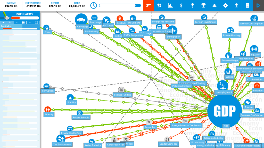
My most famous game is the Democracy series, of which Democracy 4 is the latest incarnation. Its a political strategy game where the player runs the country. Its 2D and icon-based, and looks like a giant super-complex and uber-connected infographic that the player navigates. The main UI screen for the game is a symphony of information-overload and looks like this:

I suspect anyone who was submitting this screenshot as a mock-up in a game design course at a university would get a D minus. Its clearly overcomplex. It puts too much burden on the player to identify whats important. Its messy, its confusing, it has too much data in one place. Try harder next time.
Except…that is the whole point. Overcomplexity is a feature, not a bug in Democracy 4. This is something that a few reviewers, and a few players do not get, and I understand why. Modern game design has been sanitized and simplified to the extreme. The player is treated often like an idiot, with the information-processing capability of a puppy. We never give the player too much choice, or too much information at any point. That would be BAD game design, that needs ‘reworking to streamline the UX’.
God I hate ‘streamlining’.
Whenever big tech companies like google or Microsoft talk about how their new UI is ‘more streamlined’. it inevitably means ‘its way worse, but it looks simpler’. Whoever thought that we should start hiding scrollbars until you go hunting for them should be sentenced to life imprisonment. There seems to be some belief among UX designers that options and information are things that cause infectious disease, and need to be hidden away whenever possible.
Anyway… thats not actually my point.
Sometimes, a game is deliberately BAD by a conventional metric, because its trying to create an atmosphere. Thats intentional. Thats something all forms of entertainment or art does, at least if the creator has a vision for what they are doing. The Omaha beach level in the original ‘Medal of Honor’ game was catastrophically hard. Like mega-hard. Insane hard. You try at least a dozen times before you even make it to the first ditch hard. THATS THE POINT. If your game is representing something incredibly difficult, it needs to BE difficult. Being scared of triggering any ‘negative’ emotion in the audience makes for incredibly sanitized, tedious, unchallenging, and unrewarding art.
Running an entire country is nightmareishly complicated. Being President or Prime Minister is shockingly complex. Just imagine how many different topics you need to be familiar with in order to make the right decisions to run an entire country. Its insane. There is good reason that being US President seems to create accelerated aging. The amount of information presented to a President in just an hour is ridiculous, in 4 years its nuts. And ALL of it is absolutely vital. You don’t get to put a document in front of a US president unless its absolutely important and probably urgent.
The best thing you can do with any game design, or any book, or movie, or music is to generate emotion. If we want information, we will read/watch non-fiction. We open ourselves up to entertainment because we want to be moved emotionally into some state. That might be fear, in a horror game, or a sense of calm flow in a factory game, or a sense of excitement and adrenaline in an FPS. This is the ‘core design pillar’ if you must use such a term. The game must generate some feeling in the player.
I know some people dislike Democracy 4 because the icon-based gameplay is not what they expect. They expect to have a 3D avatar of the president (These tend to be US players who only want to be the USA…) that walks around a 3D oval office and see animated soldiers saluting to them etc… But to me, thats not what being a president is about.
Ultimately the only thing that makes a president good or bad, is what decisions did they take? and did they make the country better? Speeches are great, having charisma is nice, being good at shaking hands or tweeting is all good, but what really matters is what did they do. Given the situation, how did they act? and why?
This is what I try to convey in Democracy 4. You are the president and you have a LOT of things to pay attention to, and YES it s overwhelming, and NO you do not have enough time/bandwidth to process all this, and you need to actually go with your gut and make emotional rather than analytical decisions very often because there simply is TOO MUCH data, so you have to play the game in a different way to most strategy games you have played. There are just too many variables, and too many equations and too much data. Thats the WHOLE POINT.

With anything interesting, you are going to lose some part of the audience. I definitely lose players, and generate refunds among some, because they find the game ‘not fun’ and ‘over-complex’. Thats to be expected. I suspect I gain more players than I lose, because this experience is not on offer anywhere else. Other game designers would simplify, or streamline the game. They would try and ‘guide the player gradually through a tightly constrained path of easy decisions’. I will not do that, because its not the vision I have for the game.
You can make your game too hard, or too fast, or too weird, or confusing. Its all ok. As long as you have a vision for what you want the player to feel, and you deliver on the promise and generate that feeling then everything is cool. Sometimes its ok for the player to feel overwhelmed, or confused, or freaked-out. Sometimes thats EXACTLY what its all about.
Democracy 4 is not too complex. Neither is Dwarf Fortress. Dark Souls is not too hard. Surgeon Simulator’s control scheme is not too fiddly. Agatha Christie is not too formulaic. Star Trek doesnt have too much technobabble. Its all absolutely fine.
Democracy 4 is on steam, epic store, gog, humble store and itch.