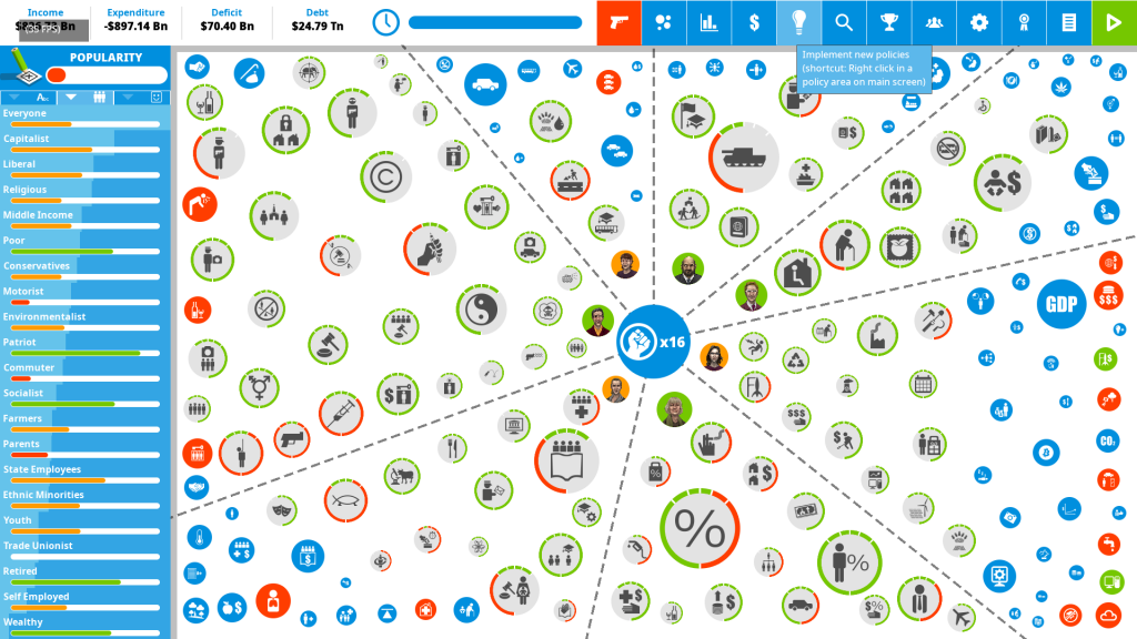
Democracy 4 has one aspect of its GUI that still screams IMPERFECT at me, and needs fixing, but its at least 10x harder than it sounds. Its the sizing, and positioning of the icons on the main UI:

This looks like just a bunch of different sized circles on a screen. How is that tricky? Let me count the ways:
- The icons have to be in specific zones, which are not rectangles, but could be any polygon. These change size and shape over time
- There has to be consistency of size. A radius 10px icon in zone A has to represent the same value as a radius 10 icon in zone D
- We could have ANY screen resolution or aspect ratio.
- There could be ANY number of icons.
- There is finite time, on perhaps a CPU-limited laptop to do all the calculations.
- The icons cannot touch the center icon, or each other, or the zone boundaries.
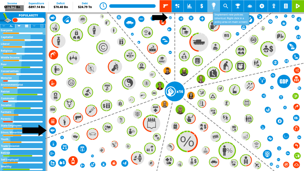
Now it turns out…coding that is a real pain in the neck. The system that you *think* will solve it all, is to have each zone boundary and icon project a sort of repulsive force on to all the others, then step through an iterative system of applying forces and moving stuff around until an equilibrium is reached. Well kinda… but no. Look again:

Those icons with black arrows are the pain. They are kind of stuck next to corners and other icons. its the shortest distance between two icons ANYWHERE on the screen that limits the size of all of the others.
My initial solution to fix this, DID make it better, but its not good enough. What was it? Basically I do the physics-repulsing-forces thing as usual, then I ‘jiggle’ each icon in turn, randomly kicking it a few pixels in different directions, then checking to see if the overall separation of the icons got better or worse with each jiggle. I keep the jiggles that improved the situation.
Actually I improved that algorithm by first finding the icon that was the closest to the others and giving that 32 initial jiggles. This is the result, (less force is better, it means the separation is better)
Pre Jiggle. Total force:[0.39] Strongest: [0.14]
Post Jiggle. Total force:[0.03] Strongest: [0.03]
Pre Jiggle. Total force:[1.31] Strongest: [0.45]
Post Jiggle. Total force:[0.23] Strongest: [0.23]
Pre Jiggle. Total force:[1.67] Strongest: [0.32]
Post Jiggle. Total force:[0.19] Strongest: [0.19]
Pre Jiggle. Total force:[1.23] Strongest: [1.19]
Post Jiggle. Total force:[0.06] Strongest: [0.06]
Pre Jiggle. Total force:[1.14] Strongest: [0.13]
Post Jiggle. Total force:[0.17] Strongest: [0.17]
Pre Jiggle. Total force:[2.17] Strongest: [0.68]
Post Jiggle. Total force:[0.31] Strongest: [0.31]
Pre Jiggle. Total force:[0.53] Strongest: [0.40]
Post Jiggle. Total force:[0.26] Strongest: [0.26]
Which is what brings me to the current state of affairs. However, this is just one of those tasks’ that humans excel at and machines suck at. I bet you can see locations where the icons should be shuffled really easily.
Something I intend to experiment with is a more focused approach to the jiggling! I can tell now which icons (in this case two of them) seem ‘trapped’ and are causing the biggest problems, so rather than just going through all of the point containers and jiggling everything, I should now focus my attention just on the containers with the problem
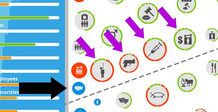
Maybe I can even focus my attention just on the half-dozen icons per container that are closest to the problematic ones, but that may not actually be the solution. Check out this section in more detail:

This row of icons has basically got trapped. Moving any of them upwards and to the right is going to be tricky, unless the icons *above* them can get out of the way. The trouble is, we need some super-clever algorithm that could move an icon above them higher (thus making *that* icon worse off… so that later we can jiggle these others… and everyone will be better off.
It might be that the initial force algortihmn is too linear. A linear force would not concentrate midns enough of the dire plight of the icon in the bottom left. If the squeeze here was not seen as just *slightly* worse than the squeeze on others, but exponentailly worse… that might fix it.
…and also this icon is receiving some strong forces from its location in the corner., Unlike other icons, boundaries cannot move, so maybe we should prioritize their plight more? Surely no coincidence that both worst-case icons are in corners?
This all strikes me as something that would be easy if I’d learned more physics and maths, but hey… working it out alone from basic principles is kinda fun. I have plenty of ideas to tweak my algorithm.