I read some stuff on twitter today (I wont bore you with the details) that is absolute crap. I guess 99% of the useless lies that I see each day on social media just fly past me, but I knew about this subject, and so I noticed it right away. To my dismay, it is heavily upvoted, liked, shared and cheered on, as always. The problem is, nobody wants to take the time to actually do any research whatsoever. The laziest of all seem to be so called journalists in the mainstream news.

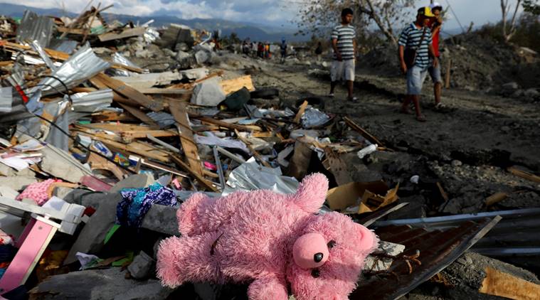
One of the major problems behind this is the concept in news of an ‘angle’ or a ‘take’. The idea is that we have to have one of these in our news, otherwise we cannot understand what people are telling us. Telling us that a town was attacked in an air strike and X citizens died is apparently something our feeble brains cannot process, unless we see a picture of a child’s teddy bear in some rubble. I presume news desks have a folder on a shared drive called ‘kids toys in rubble’ that they have a shortcut to on their desktop, to save time. We simply don’t understand the impact of war otherwise, apparently. If a teddy bear is found, the air strike was unjustified. I guess that’s the theory?
I recently heard a BBC interview of 2 party-leadership candidates that touched on Universal Basic Income. I am not a UBI supporter myself (not in principle, but in practice…another topic…), but even I could get angry at the nonsense that the ‘journalist’ was saying. Apparently we are too stupid to understand the concept of ‘universal’ unless its described as ‘people like J K Rowling will get the money too!’. Oh the horror.
This is what you get when you have spent forty years trying to explain things in ‘olympic sized swimming pools’ or ‘length of london buses’ or ’round the earth X times’ instead of using miles or kilometers, which is the whole POINT of universal systems of measurement. Apparently we cannot understand actual data any more.
Do you know how long a london bus is? or how big an olympic sized swimming pool is? Me neither. (FWIW 11.23 meters long and 50 meters).

Once our media went from reporting facts and data, to enclosing it in ‘angles’ and ‘takes’ it was a very short trip in the days of clickbait to transform the story entirely, picking and choosing context to whip up as much anger as possible. The media salivates the minute anybody is killed at a protest, or if a police officer kills someone right now, because OMG this will drive people CRAZY. No facts are required, no context required, no analysis or data required. All that is needed is the race of each person involved, and hopefully some shaky-cam footage that we can edit in order to create as much outrage and as much anger (from both ‘sides’) as possible.
Everybody knows ‘where they stand’ on a number of big political issues. We all have our tribes, and our beliefs, but how much of it is emotion, and how much of it is based on data? You are pro or anti-brexit mostly based on emotion. You are pro or anti gun-rights mostly based on emotion, and when it comes to economics…OMG peoples grasp of the data is absolutely embarrassingly slight.
Here is a quick quiz to see how well the media has informed you on some random topics.
- What percentage of US government spending goes on interest on the debt?
- Whats the most common cause of death in the US and how many does it kill each year?
- What percentage of US households earn over $100k per year?
- How much does a US senator get paid?
- What was the turnout at the last US presidential election?

I would be very surprised if anyone was close to all those answers ( I certainly was not). Here they are:
- 7.8%
- Heart disease: 647,457
- 30.4%
- $174,000
- 55.5%
We discuss politics using memes instead of facts. We either think senators are out-of-touch super-rich, or underpaid considering the tough job they do…but how many know what they get paid? The national debt is no big deal, or catastrophic depending on your tribe, but how many know what it actually is? There is no room for subtlety, or context, but only room for deciding if a number is good or bad BEFORE you find out what it is.
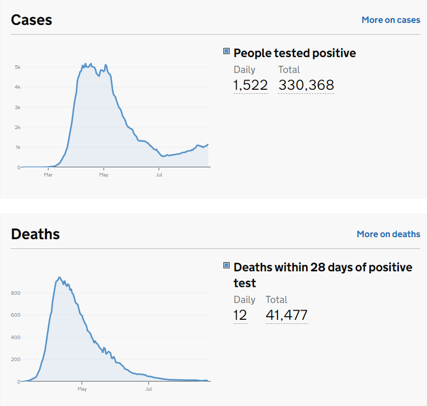
Our news providers do a TERRIBLE job. They talk about how the pound has ‘fallen dramatically’ without showing us a chart, or that gold prices have ‘soared’ without showing us a chart. Unemployment is ‘plummeting’ or ‘soaring’, again, where is the chart? Its 2020, we can cope with pie charts and bar charts and stats and numbers on the TV, but we rarely actually see them. I hear daily, yes DAILY reports about the covid crisis in the UK, but when did you last look at actual CHARTS showing you deaths and cases. here are some (official government ones):

We are not idiots, we can look at charts and form our OWN opinions. Its about time we started telling ‘journalists’ that terms like ‘plummeting’ or ‘soaring’ or ‘steep’ or ‘brisk’ are great fun in poetry, but they should play no part in serious news reports to a literate population who can understand the concept of numbers and charts.
When it comes to national elections, we are BOMBARDED with infographic hell for hours and hours showing us polling results in the most ridiculously over-analyzed detail. Why the hell cant we get those same infographic people to show us what’s going on BETWEEN elections? Give us more DATA.
But no… want to see how bad its got? I’m writing this in wordpress, using the latest editor. Its marking down my headline as not being divisive enough. I’m not kidding, there is a score of 48/100 and ‘tips’ to make my content get more clicks. Basically be more divisive. check it out:
WordPress! Now with free hints on writing divisive clickbait to help tear society apart even more… /cries.