Game Design, Programming and running a one-man games business…

Democracy 4 ministerial artwork

So…over the 3 games in the democracy series we have experimented with various ways to get artwork to represent the various ministers that you appoint in the game to run each section of the country. In Democracy 1 they looked like this:

In Democracy 2 like this:

In Democracy 3 like this:

That last game used some cleverness to kind of randomly generate ministers from a whole series of layers. It was a grand experiment which gave us loads of ministers to choose from but… I don’t think I was ever 100% happy with the results. This wasn’t exactly cutting edge procedural animation etch, but even so I think that on balance, I’d prefer to have a relatively *small* range of interesting, different hand-crafted images to choose from than try and go all procedural on the ass of this problem..

Obviously the only problem this creates is BUDGET, in that Democracy 4 will be happy to run on your 2560 (or higher) res PC, and thus we probably need quite detailed (large) images and thus we probably need to spend a lot of money on artwork for these… *gulp*.

The other issue is that the world is a DIVERSE PLACE, and we expect to sell the game all over the world so…its an impossible problem, and people will yell at us and call us sexist/racist and other terms regardless what we do so with that in mind…

HERE (below: click to enlarge) is a bunch of 30 reference images. They are all REAL world politicians. Some are nice, some are not nice. Some are famous, some really obscure, but I think they look different enough for you to recognize each one when used in a game. They will NOT be exactly like this in the game, these are just ‘reference art’ for painting the actual in-game images.
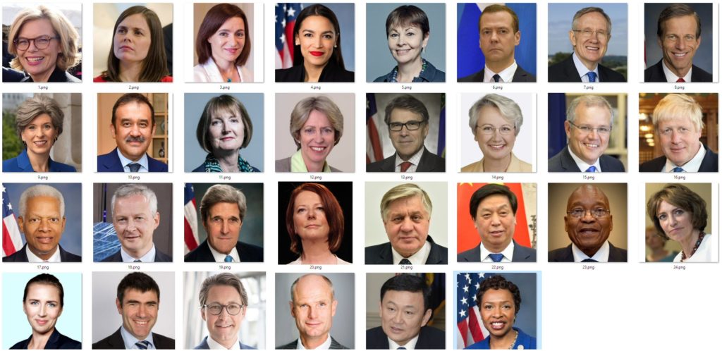
So what I’m asking is…does this look OK to you? Don’t forget that the world of modern politics is not a utopia. There are not 50% women, or accurate representation of each ethnicity. If you are governing mexico with these cabinet ministers it may look strange, it will also look strange to govern African states with this cross-section, obviously. I know that. If the game looks like being a big hit, I’d love to vastly increase the artwork range to include more diversity. Decent character art is NOT cheap! Be aware that the majority of players will be American or from Western Europe.

I just want initial feedback. Do these look like a bunch of politicians to YOU?

BTW I don’t care if you don’t know WHO they all are, or if you HATE those people…that goes without saying :D I just want feedback on the general ‘tone’. (I’m braced for being a target for absolute hatred from every angle as we develop this game. politics has never been so ANGRY)


11 thoughts on Democracy 4 ministerial artwork

  1. If they’re meant to be a general cross-section of Western politicians, there aren’t many young men. In a sample of 30 I’d expect to see, say, 3 men and 2 women under 40 (about 1 in 6), and while I can see some women who fit that bill, #6 is the only man who could plausibly be that young.

    That’s particularly important as a large part of your audience is probably men under 40, so it’s not necessarily a segment you want to under-represent.

    On the other hand if it’s meant to be a group of cabinet ministers, they’re generally more experienced and so the mix looks about right to me for the US and UK (not just age and gender but everything else too).

    1. Dmitry Medvedev (#6) is actually 53 years old :-)

      Might be younger in this particular picture of course.

  2. Yes I think so, Though thinking about the race/gender mix. Couldn’t that be an option for players, to have people in their cabinet from different ethnicities and different genders. Corbyn for example said he wanted a very diverse cabinet,.

    1. This is a good point. We have always had a thing in the game where some politicians have an affinity with the ethnic minorities or young group. That doesn’t have to be a characteristic of that politician though. For example Corbyn is old and white, and so is Bernie Sanders yet both appeal to young voters and ethnic minority voters.

  3. They all look the part, and imo it’s a fairly realistic spread for america and western europe. I can think of a couple missed representations that could possibly substitute in for a white male and white female, but if I saw this in the game, it wouldn’t look incorrect to me.

  4. What about GAN? Instead of using fixed images of people, have you thought about sourcing your images from one of the AI face generation platforms? (sites like “thispersondoesnotexist.com”).

    You could probably ask it for “middle aged white man” or “mid 30’s dark skinned woman” and get all the pictures you wanted :-)

    — pry

  5. I broadly agree with the above; these pictures seem to skew a little old for the Parliamentary makeup I’m used to.

    P.S. it was a little bit of a surprise that one of your random politicians was my recently-retired local representative!

  6. They look like politicians allright – except for Gary Busey on the far right of the second row.

    Jokes aside – no matter what you do, you might get a LOT of crap for this on twitter and woke media. On the other hand, that might be good PR :)

Comments are currently closed.