Game Design, Programming and running a one-man games business…

The big Production Line performance issue: route-finding

Unlike a game its often compared to (factorio), Production Line has intelligent routing. In factorio, things on conveyor belts go in the direction you send them without thought as to if thats the right way. In Production Line, every object has intelligence, and will pick the best route from its current location to its desired location, which allows for some really cool layouts. It is also a performance nightmare.

Obviously every time the game creates a new axle, wheel, airbag or other component, we dont want to calculate a new route along all the overhead conveyors. Thats madness, so we cache a whole bunch of routes. Also, when we decide which resource importer should be assigned with (for example) airbags, we dont want to do a comparison of routes over every possible combination, so we also cache the location of the nearest 2 import bays. Once we have worked out the nearest 2 bays, we never EVER have to recalculate them unless a bay is added, deleted, or a piece of the conveyor network is added or deleted. So thats cool.

The problem is, this happens ALL THE TIME, and its a big part of gameplay. If we have, for example 100 production line slots, and 20 import bays, then we need those 100 slots to check 20 routes each, every time we change anything related to the resource network. Thats 2,000 route calculations per change. if the player is slapping down one every 3 seconds, then thats 600 routes per second, so ten routes a frame, which isn’t *that bad*.

If the map is bigger and we have 200 slots and 40 bays, then suddenly its 40 routes per frame that need calculating. Very quickly you end up with profiling data (multithreaded) like this:

There are multiple solutions that occur to me. One of them is to spread out the re-calculation over more frames, which means that the import location could be sub-optimal for a second or two longer (hardly a catastrophe). Another would be to do some clever code that works out partial routes and re-uses them as well. (If my neighbour is 1 tile away and his routes are optimal, and I have only one possible path from me to him…calculating new routes entirely is madness).

In any case, I have some actual proper bugs relating to routes *not* being calculated, which is obviously the priority, but I need to improve on this system, as it is by far the biggest cause of performance issues. FWIW, it only happens on really super-full large maps, and custom maps, but its still annoying… Eventually I’ll find a really easy fix and feel like an idiot.

Meanwhile Production Line was updated to build 1.38, with loads of cool improvements. Hope you like it.

Designing a user interface for variable screen size

Making a game where you fully support a wide range of screen sizes is a real pain. Its a pain for any genre, but the biggest problem has to be the strategy / management genre, because of the need to display so much information. When there are a lot of stats, tables and charts, you cannot just leave GUI elements designed for the smallest supported resolution, because if you do,m you end up with tiny dialog boxes in the middle of huge screens, and a lot of really annoying and unnecessary scrolling.

The simplest option probably seems to have the size of the GUI just fixed and scale with the screen, and only allow larger monitors to make use of your 3D/2D/Iso world. This is simple to do, but it looks horrendous. As someone who sits all day in front of twin 2560 res monitors, I can testify that s GUI designed for 1280×720 res makes a game look like some sort of children’s toy when simply scaled to fit a big screen. Its not a problem with pixelation, even super smooth text looks silly when its ten times the size of your normal windows font. There is simply now way around the problem, you just have to make your design adapt to different screen resolutions.

The problem comes when you have a screen like this (the features window) in production line, seen here at 1280×768 res:

This kind of looks ok, maybe slightly cramped because the top of the dialog interferes very slightly with the top strip of the game, but otherwise, visually its ok. When we take a look at the same screen sized for 2560 res:

It looks ‘ok’ but the nice aspect ratio of the dialog has changed to be a bit less pleasing, and I’m wary of making that worse so don’t extend it height-wise any further. I could stretch it width-wise too, but then the table becomes disproportionately white-space and is perhaps harder to use. What I suspect would look better is to add a pure black ‘footer’ to the bottom of the dialog like I have on some other windows… If I look at another tab:

Its suddenly ugly as we now are showing a scroll bar we don’t need (I’ll remove that), and that pie chart should probably be top aligned rather than sat weirdly in the middle. The big question is what to do with the bottom. Even with a nice black footer-strip there is still a ton of glaring whitespace. I *could* resize the dialog depending on what tab you are on, but that is not normal and might be jarring. I could add some extra interface here, maybe showing line charts of a selected item over time, bu then suddenly I have this whole new GUI element thats only for people with big monitors…which would lead to complaints.

Ultimately this just all comes down to time, fiddling with number and ratios, maybe even fonts, to get a GUI that is usable, looks appealing and works over every supported screen resolution. I suspect that the majority of hardcore strategy & sim players tend to have big monitors, but then again these singleplayer management games are also very playable on a laptop, so you have to support both ends of the spectrum.

In any case, it feels good to be able to spend some time on this stuff. Frankly, although I think the core game is fun, and there is a decent amount of content at the moment (more will come though…), Production Line probably suffers a little bit from being a complex game without sufficiently smooth GUI or decent enough guides & tutorials to get new players into the game. There are some GUI elements that are frankly pointless, and some vital information (competitiveness of the market, for example) that is hidden away and not really called-out. Anyway… its getting better every day.

By the way, we are still donating 100% of our steam income from Democracy 3 to War Child this week, already raised about $5,000 for children affected by war, spread the word!


Donating 100% of Democracy 3 steam profits to charity this week

We are again supporting war child, who are running an ‘armistice bundle’, where Democracy 3 and its DLC is 20% off, and 100% of the developer share goes to the charity War Child, which takes care of children affected by war. Here is the link to the D3 store page:

http://store.steampowered.com/app/245470/Democracy_3/

Also a link to the war child bundle: http://store.steampowered.com/bundle/5238/Warchild__Armistice_Bundle/

And finally to the charity page itself:

https://www.warchildarmistice.org/

If you are able to share links to those, that would be awesome. I love the idea of doing an unambiguously ‘good thing’ and at the same time showing people that gamers are generous, and the games industry does care about violence, and suffering, and stuff other than memes and which console is best. I think stuff like this is really good for showing the positive side of gaming.

We supported the same charity last year and we raised $15,166.92 for the charity. it would be super awesome if we could beat that this time. if you want to know what moved me to support this charity, watch this video:

A dystopian future short story about manufactured desire

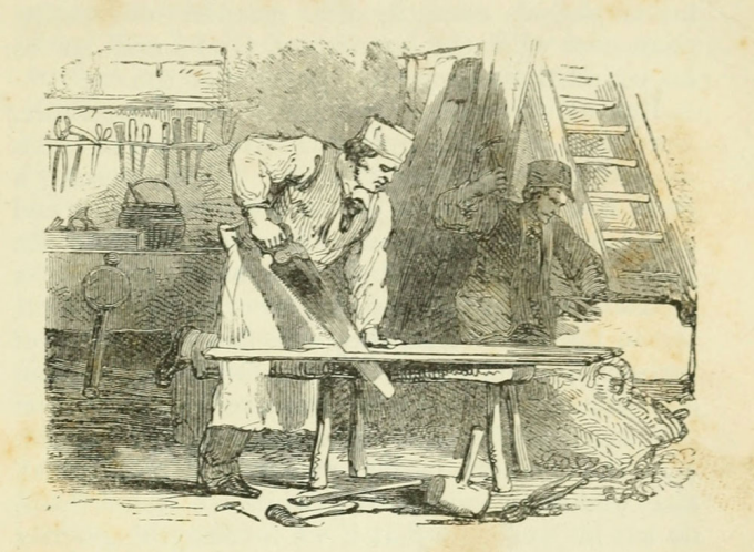
Long long ago, people used to think about what people needed, and make that thing, and sell them. people needed a table, so a carpenter made a table, and sold the table to the person. Then the person would need another table a few years later, and another table would be made. Then carpenters developed better tools, and the process of making tables, clothes, food and everything else became quicker, easier and cheaper, and we made more stuff.
Soon everyone could have not only a shared table, but their own table, and not only that, they could have multiple sets of clothes, not just for when some were being washed, but separate clothes for separate occasions. You could afford your work clothes, and you had separate leisure clothes. Even special clothes to sleep in, and then came ‘formal’ clothes, the suit for weddings and posh events. Eventually we progressed to a situation where you would have an entire wardrobe of clothes, and you picked them based on what mood you were in, or the season.

Then fashion came along and told you that even though you had enough clothes to wear, and clothes for doing X and for doing Y and clothes for Summer, and clothes for Winter, and clothes for the evening and for the afternoon, and for sports, and even for different sports (golfing trousers…) suddenly all of that was going to change because your clothes were UNFASHIONABLE. That meant you had to ditch all your clothes and buy completely new ones.

And once that worked, clever people who had by now long discovered psychology, started to apply the principles of fashion to other things, including the thing that was for many people the second most expensive purchase of their lives : cars.

Suddenly cars were ‘old fashioned’ and despite happily fulfilling the task you bought them for, you wanted a new one. This spread to almost all consumer products, not least TVs, and personal computers. We ended up buying a new laptop, not when the other one died, or got broken, but when a newer model came out that was slightly thinner, slightly lighter, slightly faster (for a while at least).

Now fast forward to a dystopian future where you don’t have a trained psychologist working in marketing, but EVERYONE is the marketing department studied behavioural economics, psychology and neuroscience. A future where most employees in the PR and marketing department are data scientists. A future where the amount of information collected about customers, and their use patterns, and their desires, and dreams, and fantasies and ideals…was all gathered by private companies who would use it, not so much for the improvement of mankind in any way…but to make a product that those people would always buy.

The endgame, the final desire of such a system is to produce a product that has multiple contradictions. It has to be seen as exclusive and premium, and luxury, and yet at the same time be marketed to everybody. It has to have a premium price, despite having no features that any rival product does not already has. It has to appear cool hip and desirable, and the company that makes it portrayed the same way, regardless of how that company behaves behind closed doors.

It doesn’t have to be any good, have any improvements whatsoever over any other version of EXACTLY the same product. It only has to be *seen to be* better, not actually be a better product. And if at all possible it needs some tiny visual indicator, visible to someone nearby, on the same table, or bar, that the person who has the product most definitely has the very expensive new one. Thats all it needs to do. And in this dystopian future, they can sell a product to you that bad, and they can be that blatant about it, because they have totally and utterly weaponized modern science when it comes to manipulating your psyche so that irrationally, you still want it, and you will still buy it, and you will make that company the wealthiest company on the planet.