Game Design, Programming and running a one-man games business…

Give me your GSB2 beta feedback

Sooo… lots of lovely nice, attractive, charismatic and generally awesome people have pre-ordered GSB2 (THANKYOU!) and are playing the game right now. Obviously in a beta, the key aim is to get as much feedback as possible. People always assume game designers are of the same mind as they are, as the players, but the problem is, we get ‘too close’ to our games, and often can’t see design issues that are staring you in the face. For example, it shocked me to see so many people field ships that were just naked hulls. I thought I’d made it really obvious how cool and new and fun the ship visuals designer was, but I clearly need to signpost that a LOT more. Here is some stuff I’d love to know from people playing:

Performance
graphics1

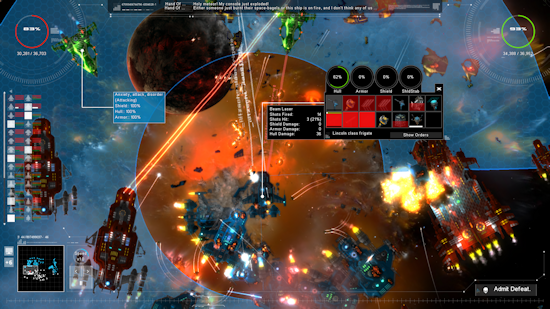
How is the game running for you? on what settings and what hardware? I have had no negative feedback, and some great feedback, but you have *no idea* how much I sweated over performance. This game does a lot more than GSB1 graphically, and I was terrified of performance issues. Am I right in thinking it runs ok for everyone?

GUI
gui_ship

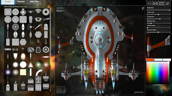
I know there have been some glitches here and there, with alt-tab in particular, and some people quitting the ship visuals design assuming that saved the ship. I’ve also fixed a few errant pieces of text, typos etc. Generally how is it? does i flow ok? do you have all the information you need and does it make sense? Has everyone worked out you right click a friendly ship in the battles to get in-battle info? I suspect not. What can be improved here? Someone on facebook suggested ‘radar charts‘ for modules which does sound extremely interesting.

Balance
gui_1

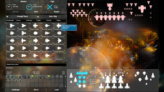
This is always the big one, because nobody ever agrees! But I suspect dreadnoughts are too cheap and too easily self-defending, and that possibly frigates are not fast enough. I think we also perhaps need a few more modules in general in terms of variety. Have I got the mix of power/crerw right in most cases? Are some of those hull bonuses maybe a bit too good? are they apparent enough from the GUI (something I suspect needs tweaking). The game currently only has easy difficulty enemies. Too easy? To hard.

All feedback is great. I want to ship the best game I’ve ever made, one that looks great, plays great and runs great. The more feedback the merrier, there is already a ton of feedback on the forums.

In other news, don’t forget to check out the latest big pharma video blog. And of course you should tell your friends they can pre-order and play the GSB2 beta right now.


48 thoughts on Give me your GSB2 beta feedback

  1. Hi Cliff,
    GSB2 on Win7 and modest hardware. GeForce 210 (1920×1080). Performance is ok so far with all options on.

    Few things I notice:
    – Need weapon range indicator during battle (you know, the highlighted area. I think you have it in GSB1).
    – Anti fighter gun seems very less effective. I capture a fighter with tractor beam but no anti fighter gun shot at it.
    – How do I give 2nd and 3rd color on the ship? I pick the color but nothing changed on the ship.

    1. Hey, you do have range indicators, you need to right-click a ship during battle, then select whichever module you want to see the range of. I should make this more obvious.

      Not all ship components have a second or third color, only some of the more complex ones. i should make that more obvious too…

  2. Performance

    In general the performance on my laptop is excellent. I have a nVidia 970m and an Intel i7-4810MQ and everything runs smoothly. I have received multiple crashes when the victory message is set to appear. The game freezes and I have to force close it to do anything else. It’s only happened a few times though.

    GUI

    I think the ship building GUI could be better if each category could be organized by sub-categories (for weapons maybe bean, missle, plasma, and defense/other or something) or if they were sortable by different stats. The visual designer is very cool but also very finicky and it seems like a significant time investment that I have not been willing to make yet. If there was a way to leverage it by sharing visual designs and importing/exporting them I think it is something I would make more use of but having to do each one essentially from scratch just isn’t something I’m interested in doing.

    In battles it’s very hard to figure out what is working and isn’t working, especially with the smaller ships. If there is a way to get more feedback as to why a ‘No effect’ message is showing up when attacking a ship that would be helpful.

    Balance

    I’m not good enough to really comment on any balance issues but I will say I haven’t found much use for the middle-weight ships. Dreadnaughts seem to fill all the roles Cruisers can fill only better and Fighters and Gunships seem to cover everything else. Destroyers and Frigates might be better at something but I haven’t come up with a way to use them properly.

  3. When doing all the initial looking around and the popup help menus, the visual editor part of ship building didn’t work. It only showed the items on the left, but rest of screen was blank. Help popup wanted me to select an item and place it someplace as I recall, but that was impossible since the screen wasn’t appearing right. Going back in later it worked fine.

    Only other thing I’ve noticed is the line drawing a target from your ship to an enemy ship will disappear behind a background planet (like in the first mission after the tutorial level).

    A tooltip via the mouseover to compare a 2nd item (weapon, armor, etc) with the selected one (like with gear in MMOs) would be very appreciated.

    I’ve not played enough to have any comments on balance/etc.

  4. Win7 64bit
    8G ram
    GeForce GTX 770, version 344.60

    After alt-tabbing, my perf starts dying during combat. Ships skip frames and jump around a bit even though the overall frame rate is still not suffering. Damage text is unaffected and smooth.
    The issue is more apparent on the bottom part of the map than the top, which is curious =)

    Screenshot via steam f12 lists the game as Democracy 3.

    SIM_ShipDesign.cpp 358 chokes at 64-68% loaded for battle citing different ships each time. Hard crash 100% of the time here.

    Dreadnaughts are definitely too cheap and easy to defend.

    Gotta say bud: perf, balance, and stability are really what betas are all about. This game is going to be amazing once the sawdust gets swept up. Great stuff!

  5. Win7 64bit
    I7 930 2’8Ghz
    18GB ram
    GeForce GTX770 4GB, 347.09

    Performance : All to max, ok, smooth, without problems, until it crashes :-(

    It crashes at the end of “Cliffskis test challenge”, when I win, always (long battle), and at the end of the Kolterri battle (4th), when I win too, but only once.

    Firma con problemas:
    Nombre del evento de problema: APPCRASH
    Nombre de la aplicación: GSB2.exe
    Versión de la aplicación: 0.0.0.0
    Marca de tiempo de la aplicación: 54d38fbb
    Nombre del módulo con errores: GSB2.exe
    Versión del módulo con errores: 0.0.0.0
    Marca de tiempo del módulo con errores: 54d38fbb
    Código de excepción: c0000005
    Desplazamiento de excepción: 000f11ee
    Versión del sistema operativo: 6.1.7601.2.1.0.256.1
    Id. de configuración regional: 3082
    Información adicional 1: 0a9e
    Información adicional 2: 0a9e372d3b4ad19135b953a78882e789
    Información adicional 3: 0a9e
    Información adicional 4: 0a9e372d3b4ad19135b953a78882e789

  6. Performance is great for me. i5-3570K, AMD HD 7870 gpu, 16gb ddr3-1600 ram Win 7pro.

    Is the beta supporting the challenge maps? I’ve tried your hosted battle and it crashed both times before finishing.

    I could not find a way to change the standard battle from “normal” to “hard”, etc.

    I’m still learning the new weapons. Pulse cannons are great! Plasma’s are not as effective as in GSB1 it seems.

    1. Yeah, Plasmas are only good if you use a whole lot of them, they seem far more inaccurate, I wonder if target boosters would help… I arm my primary damage dealing ships(dreadnaughts :P) with heavy plasma cannons and nukes. The plasma cannons kill the shields and armor and the nukes shred the hull. Also, I’d appreciate it if there was some reason to use 3 types of weapons. As it is right now the plasmas are 100% effective against all defenses, so why would you put 2 100% effectiveness weapons on when you could have one do the same thing? :/ Just my food for thought on the matter.

  7. I just heard about this. Is there a new features list? I would play on mac so I’ll wait to buy. But I’d love firing arcs (which if they aren’t there might help with your dreadnoughts). Is there terrain?

  8. Coming from GSB 1 my first impression is awful:

    Design Screen:
    I’d like to have a clean UI: all that pseudo-moving graph / unreadable text without function other than illustrative distracts me – I hate it.

    Module-Icons: in GSB1 you could tell different lasers by colours. Same thing for shields. And Engines looked like Jet-Engines – you could recognise them at first look – making them slim or fat was ok, you could still see what they where. Same for crew departments: they looked like cockpits – perfectly ok with me.
    Now in GSB2 you give every single module a distinct look!?! Really?!? Man that is a lot to stuff to recognise… – in my view that makes it tedious to learn for no good reason.

    Battle Screen: What was wrong with showing the ships modules of the ship you selected in battle at ONE FIXED POSITION (- bottom right in GSB1)? Now when I select a ship it’s modules / info screen moves with the ship and I can have open as many as I want cluttering my whole screen with information that overloads the already hyper-dense graphics.

    I will play a bit more and see if I can get used to it.

    But right now I feel that a little more simplicity would help me recognise things, rather than have an overload of “flavour” stuff. I mean you can bring in “flavour” with different races – no need to add extra screen clutter. You already added more ship classes and ability to change optics – no need to have all that extra “flavour” in icon design: you should be able to tell the basic function of a module right by looking at it – like it was in GSB1.

    1. and I don’t like that blurry background picture while designing my ships.

      How about a clear background? Or a picture that looks like a workshop (like “garage”-view in “world of tanks”) or the inside of a space station (like “Elite: Dangerous, or more basic / simple like in “Robocraft”)?

      It would be nice to know: Did you have a different guy for the looks of the modules / icons in GSB1? Or have you just changed your style / attitude of how things should look? It’s really hard for me to get over it… – maybe if I hadn’t played GSB1 it wouldn’t be such a big issue for me.

      1. OK sorry – I need to apologise. After a little more playing I start to recognise things more easily and see the similarities in modules of the same type. It was just the first shock of having the looks changed so much since GSB1…

        1. After getting used to it:
          I like the red target vector (“tactical target”) and green moving to vector.
          I like the “full circle” / “100%” display of shields / armor / hull.

          I found a bit irritating, that full shields are blue, down shields are red.
          I would have prefered for the shield bar display after the shields are down to either become invisible / black or stay the same main colour but less bright (darkish blue / greyed out) instead of red. Also a bit counter-intuitive at first seemed to me that the order changed: barview in shiplist is: shield / armour / hull; circle-view on individual ship is: hull / armour / shield / shield stability. But at least you kept the colour-coding the same.
          An alternative design would be having the order changed on the circles – but then I would change the circles to “right-aligned” to keep them go-down from center to side. Having them go down from outside to inside (hull-circle “non-aligned”) would look even more strange: I like the hull-circle aligned to one side (left as is, or right if you changed the order to shield / shield stability / armour / hull.)

          I guess you have a forum for more comments… – will play a bit more first.

  9. The game looks awesome, but really digging into it is being stymied by a bunch of “file not found” and similar errors. SIM_DeployedFleet.ccp this time, but it was something else before. I think you’ve been working on related items, but it’s really causing issues in the beta.

  10. We all had to get used to the new look Hartmut. I like the new look and graphics. I do miss the colors for lasers/beams/etc. That is useful to the naked eye as to effectiveness during the battle (not waiting for the post battle stats) and what the enemy is using against you.

    Weapons: There should be a definite difference between types of weapons–such as some are great against shields, or armor, or hulls. They should not do it “all”. This forces ship creators to use a variety of weapons or at least a variety of ships. There were a couple weapons in GSB1 that after using them, I found ineffective or just plain LESS effective than other weapons and so they sit unused. I hope that doesn’t happen in gsb2. I have to play some more tonight to give more feedback. :)

    1. I take back that statement as each weapon can be analysed in-game nowadays and you can see shots that hit vs. shots fired, etc. VERY nice.

      It is taking some getting used to the moving/movable ship stat box after right clicking on a ship. I’m used to it appearing in one place.

  11. Is there a ratio of fighters to carrier bays? I think there should be. In one battle I had 3 fighter groups assigned to one dread with just one bay. Will fighters be wiped out or less effective with not enough carrier bays for repairs, etc.?

    I would also like to see an endless battle like “Veil Nebula” and the others in this game.

  12. I’ve had a lot of fun designing the ships with the visuals and colors! I think it is a great addition to GSB2. I took screenshots with Steam and it thought I was playing “Democracy 3” LOL. It would not allow me to upload them, it said I was not connecting to steam, but it may have been the shots in a non-steam game. :) Anyway, I digress.

    It would be nice to be able to adjust the visual part sizes, especially the cockpits. If it is too difficult to add such a tool (as I guess it would be), maybe add more cockpits, especially smaller sizes (we can always put multiples on). One giant cockpit is feasible on dreadnaughts, etc, but I don’t think the large dome-like flight deck should be the only option. The antennae and other pieces make great additions. The mirror tool is nice, once you put a piece on, it automatically aligns the opposite side (as in wings and such) to match. I was trying to line things up at first and then tried that—wow, what a time saver. :) The color palette is nice too. The “undo” button helps as well. Overall, I like the tools to design the visuals. Folks just need to try it and they’ll like it.

    In regards to fighter bays and fighters—I think during the deployment phase, fighters should not be able to be added to the fleet unless the proper size or number of bays is available. Basically, they cannot get to the fight without the transport first. So one dreadnaught with one large bay could not bring 50 units of fighters. **Unfortunately, this would prevent fighter or fighter/gunship/frigate battles which can be fun in their own right.** So how does one go about this? Maybe it can be added as a mission specific rule like anomalies, and engines required. In this case, it would say “fighter transport bays required to get to battle” or something like that. Get my drift?

  13. Well, my game downloaded a pretty sizeable update a bit ago. I noticed pop-up tutorial/explanations. Nice feature—it may get annoying if they always pop-up, but it seemed once I closed them, I did not see them again.

    I played a challenge fleet posted by another user, yet once again it crashed at the end. I am guessing that it is crashing at the point a winner or loser is determined based on my fleet or his fleet’s status at the time of crash. (Oh and I really need to tweak my one dreadnaught- it didn’t last too long-haha).

  14. Re: Shields?

    I built two versions of a destroyer. Destroyer 1 has a heavy shield + light shield. The light shield has 50 strength, the heavy shield only 30. Now, the heavy shield has better resistance (17 vs 7) but…when the 2 are together, I am much better off having a heavy shield + light shield (Strength=93.60, Resistance=17.00) than 2 heavy shields that cost more and weigh more (Strength=70.20, Resistance=17.00).

    Is this how it should be or a small glitch? After thinking as I type this, one is for resistance, one for strength, stacking is just not as good as variety. So maybe there really isn’t a problem. I was disappointed when I saw my 2 heavy shielded (stacked) ship didn’t look so good when looking at the numbers.

    Question 2: Can you tell us where ships are stored (folder)? It would be fun to share ships with friends. I was also thinking that once you are on Steam, saved ships and/or fleets could be a “Steam Workshop” thing if they would support you with that.

    1. I’m just tweaking shield resistance in this patch actually. I agree re:steam workshop, I have that planned. Ships are in \my documents\my games\gratuitous space battles 2 \ships

      1. I’m trying to help you, and I’m not sure which things you are aware of and are not. So please don’t be offended as I point out things I notice. I have almost 300 hrs in GSB1 and I’ll likely spend too much time in this iteration as well. haha!

        Powered Armor: It costs more than standard armor, absorbs less dmg and actually requires power to use. It definitely needs tweaked in comparison to non-powered armor types.

  15. The game looks very promising. I’ve been having some difficulty with the game freezing when going to the battle screen. Looking at the error message, it appears that the game is trying to load a previous fleet containing ships I’ve deleted. This causes the game to freeze.

    Secondly, a suggestion. This being a game about ship design and performance, post-battle stats need to be FAR more granular. Show me each ship, with a way to drill down to how much damage it took to each system, how much damage it did to other ships with which weapons,

    Thanks again.

  16. In the “challenge” games, it is possible for ships to leave the visible map and then return during the battle. I don’t think it has happened in the standard battles just online challenges so far. I’m referring to specifically the guy who made a fleet of very fast dreadnaughts (7). He has 2 versions, the 2nd one is the MK2 version. I can’t think of the name of the game or user who posted it. It starts with a “T”. The ships leave for quite a noticeable time and then sail back onto the map in a different location. My gunships followed him right off the map and then returned as well. I am playing on 1920×1080.

  17. I’ve encountered a new problem where the “edit” ship option during deploy deletes my fleet after an edit. It worked before but does no longer. So if I place a bunch of ships, then decide I want to tweak one during deployment, I will have to reapply all my ships. I’ve made a “note to self” to save fleet before editing. :)

    1. Oh, and I cannot load a “saved” fleet in the challenge deployment screen. So much for saving that group. :( The file is visible, I click on it, it shows up in the box at the bottom next to the “open” button but then when I hit “open”, nothing happens.

  18. After spending an evening on the game (and not having played the first one) I have MANY thoughts on it

    * Bugs. As this is beta, I am aware that bug smashing is an never ending process, but I would very much like an in-game (or other official means of filing specific bug reports)

    SHIP DESIGNING
    * Explanation of some of the nuances of the hull types. I want to build an escort ship that will completely obliterate nearby fighters, do I build it on a frigate, cruiser or destroyer hull?
    * More information about some of the more unusual ship modules. I built a Cruiser with four decoy modules, a camouflage shield, and armed to the teeth with Tracer Limpets, thinking that it would be some super-stealthy high damage close combat vessel, only to have all of the enemy fighters swarm and focus them down in the first salvos of the game, and I never did find out what Limpets DID.
    * Change the Ship Design interface so that you’re only dealing with one race at a time. If I’m in the thought process of redesigning my terran fleet, I dont want to be viewing my alien hulls in the hull selection window. (or at least put them into their own foldable groups by race so I can hide them).
    * I am REALLY not a fan of the “Just change the name of the ship to save a new ship” philosophy for ship design. If I just finished working on a dreadnaught, and then want to start creating a destroyer, I currently change hull type, start building and then forget to rename the ship and update the description meaning that when I save it, it overwrites my previous design I just spent an hour tuning. Using a New/Open/Save/Close/Copy paradigm like most document editors would probably make things go a little more smoothly.
    * Divide the module properties up into easier to read categories. Things like Cost, Weight, crew and power consumption generation should be in a different section than things like damage, shield penetration, firing speed, and range. Also, it would be nice to know at a glance how each of those properties compares to the rest of the modules so you can quickly identify what that module is tweaked for (without having to open up the window listing all modules relative to that one). Example: A weapon with an incredibly short range, fires really quickly and has a high traverse would probably by good for anti-fighter ops, where as a weapon with the maximum range, slow firing and high damage is a sniper weapon. I suggest using partially filled bars to denote a module property’s relative strength [++————]

    BATTLE
    * Prioritize clicking on large ships during battle. I’m less interested in fighters at a higher z-level than the bad ass superdreadnaught below it taking massive damage.
    * Some further explanation of why my weapons are having “no effect” would be nice so I’m not wasting time trying to diagnose WHICH weapons are having no effect when I need them to.
    * More granular ship by ship stats. I want to know exactly how effective each of the ships I’ve spent hours designing are. Is the long range missile boat missing everything because it doesn’t have enough targetting arrays? how often was it firing vs not firing because it spent too much time rotating to aquire new targets? How long did it live? How much hull damage did they repair before the died. On average, how long DID they survive, what were their kill tallies? I just need to know if the ship was a poor design, or just didn’t stand a chance against that enemy.
    * During battle deployment, it would be nice to know at least the CLASS of ships we’re going against, as issuing orders to focus down frigates is useless if what you thought were frigates were destroyers instead.
    * I want to be able to design a formation, assign fighters to carriers, give them all different orders, and then be able to save JUST that formation so that I can, during other battles, duplicate that task force. My understanding of the “Save Deployment” function currently is that it saves the entire deployment FOR JUST THAT BATTLE. You cant then bring your previous deployment to the next battle without completely rebuilding it from the ground up.
    * ZOOM IN AND OUT!

    1. I keep remembering new things, but also, I *suspect* that the rate that a ship can spit out fighters is limited to a fixed amount per ship, but from a design perspective I wanted to build a massive superdreadnaught that had a dozen carrier bays to carry all of my fighters to make deployment easier, but since it just spit fighters out at a constant rate forever, I get one at a time over a much longer period, significantly reducing my fighters effectiveness wheras I would expect having 12 carrier bays would mean I could get them out twelve times faster. Launch Tubes could perhaps cycle them out even faster at the cost of capacity.

    2. just fixing it so the name gets blanked out when you change hulls…as thats a trivial quick fix for that issue, which is indeed annoying…

  19. Since this last update (1.7) I’ve been experiencing game crashes which I did not before. It last crashed at the battle finish–declaring the winner and freezing.
    I need to document each specifically, but an auto report method would be useful as mentioned above. Overall it seems to crash at transition times, disk access? or high CPU usage? I’m not sure. I’m running an i5-3570k. CPU usage hovers around 23% using just under 4gigs of ram (with background prgs). I turned off a few background programs but left on Antivirus and AMD gaming evolved app.

    Also, minor bug: gunships when deploying on a vertical play map, still assemble in the horizontal grouping.

  20. hey. minor thing, but can you please, please, please, please, please write temporary descriptions of what weapons do? even if its out of game.

    all of the missiles have the same description, I only know what, say, ECM does from playing GSB, and even that is just a guess.

    all of the pulse lasers, including the radiation beam, have the same description, etc etc

  21. HD quality version of this soundtrack would suit the game … or any space game ..

    youtube com/watch?v=d-11W4NP1hM

  22. (I do notice that atleast in this video the aliased font seems to be fixed and the weird blurriness that bothered me in your screenshots isn’t atleast obviously present)

    I noticed that in this video v=7RHJPKHqG5c, the player noticed they are about to be defeated before the “composer” does. Clearly if this was a Hollywood production, the composer would give the music some sort of desperate tone to build up anticipation of what’s about to happen before the player gets the idea. Right now the music feels between neutral to optimistic.

    The burning stuff around the ship is not dramatic enough – I’d like to see the whole ships cut in sections with a long massive torn-apart sound (perhaps by attenuating the other sounds and music slightly to allow for dynamics) like ones used in those naval movies where the ship/sub is about the sink.

    Also the horizontal lens-flare type of effect that’s in a lot of objects is slightly too attention grabbing. I’d consider trying out some sort of attenuating intensity curves with modulation to create a shimmering lens-flare effect where the intensity fades more gradually than now (it seems the fade is right near the end now and the middle is largely “flat”).

  23. Looking nit picky critically at the visuals here’s some things that I’m not sure how to fix: The ship lights (that may flicker) and the asteroids have quite soft look to them. It’s hard to say if it’s due to youtube compression or what. I’d need a 200+ DPI high display to better say what to do here.

    The explosion effect seen in that video might look better if the shockwave stuff propagated slightly faster and I’d experiment with some sort of unrealistic quick pulses of various intensities of everything in the screen or only the objects (eg. assuming some “space dust” was around from the battle or some gas present, having that slightly light up very shortly during the most rapid part of the explosion might intensify the overall effect). The explosion now feels a bit “relaxing”. Perhaps some like that but I’d prefer either slowly breaking apart ship or quite snappy and shocking/surprisingly intense explosion.

    Both explosions I studied has 2 “waves” centered on the ship. It would be more interesting if there was different type of explosions and their origin was depending on module placement. Maybe some sort of “hash” could be calculated from the various locations and parts used and the weapon that dealt most damage and that value would be input to the system determining how the ship breaks apart or explodes. Though there’s probably higher priority stuff to deal with :-)

  24. I just noticed (v1.18) that during a battle (challenge battle) my enemy’s ships had used the colored-lighted blocks behind his designs. Upon explosion, they did not disintegrate like the other items on the ship. They stayed as a large square or rectangle which looked odd among the other rubble/detritus. Prior to this, his ships looked great (Bug1719 or something like that was his name).

Comments are currently closed.