I admit it, it makes me cough and splutter a lot when people say ‘I don’t want to go to the trouble of designing the look of the spaceships, so I just slap down an empty hull graphic‘. It worries me because there are several downsides to this. Firstly, they are missing out a big part of the game, especially a big part of what makes GSB2 new. Secondly it means their challenges, screenshots and videos are going to give a poor impression of the game, because those naked hulls are…well naked, and simplistic looking. My engine can do better! Thirdly (and perhaps most importantly) it suggests that people think the ship design interface is too complex, or fiddly, or time consuming. This is something I’ve been working on.
Firstly we now have a lot of fixes that make composite objects work better, and rotation speeds are fixed, and there is now a handy ‘reset to zero’ button for rotation speed. Plus the interface now only shows color layer options when they are relevant, because always showing three confused people, as there are rarely three layers to adjust…
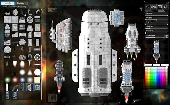
But something that was suggested, and it was a great idea, was that the game should come not only with all these tiny little widgets, but also some pre-built big components you can drag and drop to make the process quicker. I agree. This now acts as a half-measure between those people who couldn’t be bothered to design at all, and those who spend hours adjusting each fin. Here is a screenshot of a naked hull surrounded by some of the pre-fabs you can choose from.

Those pre-fabs are ‘composite objects’ and you can just right click on one and split it into all its components. Each one has a big pile of them, and you can delete one, move one, and then regroup as a new composite if you like. You can scale and duplicate/mirror/set colors for composites just like anything else, it’s one of the ship editors best kept secrets.
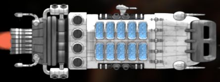
On that topic, I should probably give some love and attention to nudging people into using the hotkeys on that screen, as frankly I never touch the size or angle slider for anything, its so much easier to use a mouse wheel with ctrl or shift. Here’s a closeup of a composite, made up of probably 30+ components.

I’m going to spend some time today just making a few of these for each race. They act both as ‘quick-fixes’ to otherwise dull looking hulls, as well as a demonstration of the way composite objects work, which hopefully will nudge more people into creating their own. Eventually I’d like to see collections of them in the steam workshop or as lists of mods on the GSB2 website. I can foresee people getting reputations as expert ship designers!
If you just stumbled upon this post, this is a blog about the PC space strategy game ‘Gratuitous Space Battles 2‘ which is currently in beta, and you can pre-order the game and start playing right now by clicking this link here. Tell your friends!