Sooo… I’ve been experimenting with lighting of spaceships for GSB 2. If you played the original game you might be aware that although it often looked pretty l33t, it also had a tendency to look a little ‘flat’. The lighting was always the same (apart from the odd ‘global’ shader effect, and it could certainly have had more depth. This is one of the things I wanted to address when re-doing the game. The original game just had simple sprites for ship hulls, and the new version is tons more complex and lets me do lots of magic. Basically, I combine sprites for the ships with normal maps, and specular maps and lightmaps, and use a shedload of different shaders and render targets to do all kinds of compositing voodoo. So here I present some early screenshots showing me monkeying around with the options I now have. It’s a GSB 1 ship (as a test) and it looks like ti has another one stuck to the front of it. This is a test of something else (secret!) but it shows how one ship can now cast a shadow on another (Not correctly positioned yet, but easily fixed…)
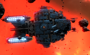
So here is a screenshot showing the bloom effect everywhere: (click to enlarge)
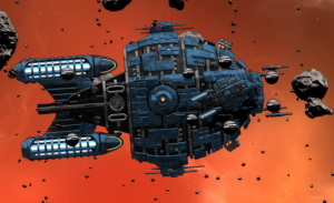
Here is one with the bloom effect turned down but the 3D bumpiness up a bit:
Here I turned down the exterior lighting, and may have moved the lighting direction too:
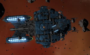
Now I’ve gone full-on moody lighting and likely moved the light again:
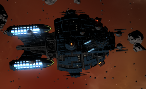
Now I’m in real ‘dark-battle lit only by the light of our warp engines mood:
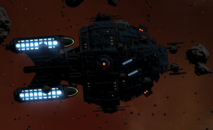
You really need to see it all big screen (and moving!) to see the full effect of it all. And you also need to compare it to the original flat looking default-shaded sprites in GSB 1 to imagine the final effect with all the battle raging around it. I’m quite pleased with it so far, although there are loads of things that need improving and tweaking, and no doubt needs more optimizing. It’s a start though!