Game Design, Programming and running a one-man games business…

Finally added a pop-up timeline…

I should have done this ages ago. It wasn’t anywhere close to as tricky as I assumed it would be. The polling screen now has a timeline along the bottom with little icons for everything that happened in each turn. if you hover the mouse over one, they expand to show all of the ‘stacked’ icons for everything that happened, together with tooltips. You basically have to remember/guess what you did,. so if it was a policy, you need to remember if you raised/lowered/introduced/cancelled it. I might add further tooltip data to clarify that. Either way, this is definitely an improvement.
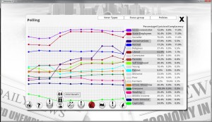
pollingscreennew

Click to enlarge.


2 thoughts on Finally added a pop-up timeline…

  1. I like what you’re doing with this new version of democracy.

    My idea would be to color code the icons accordingly. E.g. make the grey circles red/green, or color the black symbols, or both (to distinguish them from the other icons with colored backgrounds). For cancelled policies, you could cross them out or “grey them out”. New policies would get another color/effect. Don’t know what would be best there. (Excuse my English, it’s not my language.)

Comments are currently closed.