Game Design, Programming and running a one-man games business…

Help me decide about Health bars for enemies in my game…

I’m just not sure…

The majority of tower defence games (and on this issue, GTB can be considered one, even if it’s vastly different to it in many other ways). Take a very simple approach to showing you the health of enemy units. A simple green/red bar over the top of the unit is displayed all the time, simple as that. I have always found that to be horrendously ugly and clunky, and was very very pleased with the solution I had in GTB, which was chunked-circles of health/shields/armor that gave you much more information in a much nicer way (if you ask me :D).

However… deciding HOW to display health is only half the issue, the other half is of course, whose health to display.
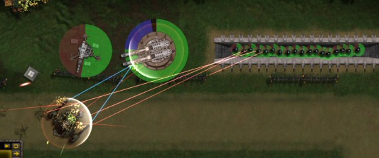
The first beta release of gratuitous tank battles only showed health circles for your units, and only when a unit was selected. they defaulted to all off, but you could (temporarily) toggle them all on with a fairly hidden shortcut key.

Due to public demand, I’ve improved that so thereĀ  is a button for health circles, they default to ‘on’ and they will stay on all the time if you prefer. There is no way to see the health circles for enemies.

My reasoning is thus. You get an extra bit of unknown-information tension in the game when the exact health of an enemy unit is unknown. As a potential game-winning enemy unit trundles towards the exit square, you have to bite your nails and hope those gatling guns you have trained on it are going to finish him off before he gets off the screen. It’s tense, it’s worrying, it’s exciting, and it builds suspense.

This is my view, but I know some people are shocked to find that the approaching enemies do not have health bars. I guess the tradition with tower defense is to show them but I’m pretty certain there is no set rule for an RTS game, and certainly none in an FPS game. Why the convention for TD games? Does it make the game too easy, too predictable, too much a simple matter of number crunching?

I’m willing to be argued round, but I’d rather balance GTB to be one way or the other, than take the easy route and just give the player the option. What do you think? health bars on or health bars off?


27 thoughts on Help me decide about Health bars for enemies in my game…

  1. For me – Definitely on (or at least able to be turned on) – How am I suppose to know if I have just about destroyed a unit (“if only I placed one more!”) vs the units I have placed have had no effect at all on that type of enemy.

    Its just as tense to me to see the health bar diminish. Will my units destroy it before it is out of range? So close. etc.

    Note: I have purchased GTB but not had time to play it yet – so maybe unit health can be determined visually as easily as well without a health bar.

  2. If you want the game to be a visual feast and about discovery without hp bars, get rid of the numerical analysis at the end too, that way I’m not incentivized to ignore/speed through the combat that I can’t interpret anyway and get to the boring list of numbers at the end to get the most information.

    The convention was almost certainly born out of Warcraft 3’s health bars, where I would argue the modern tower defense game originated. If you do offer them, please provide a user setting for Default on/off witha button that would temporarily toggle to the alternate state.

    I think from a learning standpoint, getting to see which units and which portions of health are dropping faster/slower provides me a lot of information that is difficult to extract from the after action reports. Analyzing numbers is very satisfying for me, but if I was playing a *game* that forced me to get that information by carefully watching gratuitous tank battles.. that might be pretty bold — and even more fun.

  3. I don’t like that I can’t see enemy bars much. I wouldn’t mind if that was an upgrade or power, and you couldn’t by default.

    Regarding the health bars themselves, I would propose a “smart bars” option. Bars would show up when:

    * When a unit is “fighting”: attacking, being attacked, or being targeted by units or the cursor
    * When a unit health is regenerating
    * When I’ve got a “healing power” selected, friendly units show their health if < 100%.
    * When I've got a "zone attack" power, all enemy units should show their health (if I'm able to see enemy health).

    Otherwise, bars would stay hidden.

    Also, a little nitpick: probably it's time to consider not using the term "bars". "Discs" or "arcs" seems more appropriate for the current case.

  4. While an entirely different genre, since playing Monster Hunter, I loathe most enemy health bars. If anything, they take me out of the game.

    That said, if you do have enemies without health bars, there needs to be some visual representation of damage. I’m not 100% up on GTB visuals so not sure if this is already in place, but as long as people know they’re doing damage, it’s enough. We don’t need to know everything. That comes from trial and error, the beauty of GSB if you ask me.

  5. Whoopty nailed it, I think most tower defense games have health bars to make up for weak art assets. I much prefer visual damage, smoke, sparks and sound effects as an indicator of enemy condition. As long as the visual clues scale in intensity in a consistent manner I’d prefer not to see a health bar for enemies and only see them when selected on friendlies.

  6. I like the idea of a scout unit ability being able to show the health of the enemy, then it’s an optional extra or something you get on Scout/Recon Units.

    As health/configuration information is valuable tactically.

    PS are you going to bring in Airborne Units, e.g. Jump Mechs, Paratroops, Fighter Planes, Attack Helicopters, Artillery Barrages, Cruise missiles ect.

  7. I also think it should be a unit ability, or just left out for now and added in an expansion.

    Otherwise I’d just leave it out entirely. Warfare is, largely, about incomplete data and that’s the interesting part of warfare simulations.

  8. If there’re no health bars, the unit should be easily – and rapidly visually identifiable as good/medium/poor health.

    The problem I find at the moment is that everything under heavy attack is trailing smoke, but I can’t tell any difference between full health and about to blow up. (This was also the case in GSB, particularly with reppers which gave the visual appearance of full health when actually there was no armour left for example)

    Change it so only things about to fall apart are beltching smoke, and I’ll grant that health bars could be left off.

    I just watched a truck be attacked..: at about 75%, it started spewing flame and smoke.. then at about 20%, the fires all went out – and at 5% it looked fine apart from the glowing spots. The thing causing all the damage indicators was incoming fire .. not damage. So it looked about to blow up while under heavy attack, but once past that point the fires went out, and it ‘looked’ fine… though almost destroyed.

  9. Visual damage indicators are far superior to immersion breaking, graphic obscuring health bars/circles.

    The game just needs to match the visuals to the damage taken.

  10. I like the lack of information and the tension it builds to not know just how much pounding an oncoming tank will take. I like the idea of a unit that “scans” oncoming tanks or cannons to see what is there, but I’m not sure I would use it so much. Perhaps it could be a function of a command center that you earn and then have to choose between that and increased rate of fire.

  11. As to health “bars” on your own units — even if they’re hidden, you could/should still show them on mouse-over (without the need for a click). It will even provide some visual feedback before selecting a unit.

  12. I think you should continue to not show enemy health bars.

    As far as the current display of your units health bars, I still highly recommend my suggestion from your last blog about health bars. That was to not have “Chunks” in the circle for health/armor/shields ect. But to only show the relevant color on top.

    For example, if a unit has health armor and shields. You only see a blue circle for shields, as the shields are widdled away it reveals the yellow armor underneath. Once the shields are completely gone the armor now drains revealing the red health underneath.

  13. in most td games, it doesn’t matter if you show the health bars of the enemies at the start – they don’t scale in reference to each other, so you don’t know that enemy b has 20% more life than enemy a. you just know that it has 100% of it’s life and you differentiate how much “tougher” it is based on it’s graphics/colour.

    you don’t need to show the health bar all the time, just when it’s changing. if a unit takes damage/gets healed, fade the bar in, keep it there for x seconds, then fade it out. kind of like how the browsers iphone/ipad deal with the scrollbar – they just show it when it’s being used; other than that you don’t care

  14. Friendly units:
    For friendly units the health circles should initially be off. Visually it is much nicer without the health circles. So don’t show them to people who play for the first time.

    There should be a toggle button to display all friendly health circles. GTB should remember the state of this button so that people who always want to see the health circles do not have to turn them on at the start of every single battle.

    Enemy units:
    I’m not sure about this one. Personally I would like to be able to see health circles on enemy units.

    It would be much more easy to learn which weapons work against which units without having to study all units in the designer… you would be able to learn while playing just by watching. (The damage numbers are an indication but not a real replacement since I don’t know how much is left… or how fast health depletes… or with what type of defense the unit starts with until I see the first blue/red damage numbers.)

    But I can understand that you want to keep the enemy health a secret. (Technically you could track all damage numbers and add them up… but that wouldn’t be any fun… and not possible for more than one unit at the same time.) It is very tense feeling to see this one unit approaching the exit and you can only hope that it will be taken out. That’s right.

    Also the argument that in reality you don’t have a complete picture of your enemy counts. (Games do not have to be like reality… but this argument still has a point. You don’t always have to know everything.)

    If you decide to show health circles for enemy units it should be handled in the same way as above for friendly units.

    If you do not show enemy health circles then at least show more info about the enemy than just the name. e.g does it have shield or armor. Which weapon type does it use. Without this basic information I would be forced to print out a spreadsheet with the name of the unit and all its values… and with what unit it is best countered, etc.

  15. I haven’t bought the beta, so I guess my opinion doesn’t count… But oh well.

    I would say it depends on your animation stages… Are you really clearly showing units are hurt? Using whatever particles/ sprites or what-not? If you have 3-4 demolition stages for the graphics, then I would confidently skip the health bars…

    Again, haven’t played yet.

  16. You could have an “Intel” or “Scanner” or whatever tower that enables you to see enemy health bar in its active radius.

  17. why not just have the enemy health not visable in a ‘Hard’ Mode..?

    how are you to tell visually how well some defences work against certain units, not all of us are stat-os and don’t want to memorise the manual/damage charts.

    I recently brought iBomber defence and Pacific, it was great fun and a little like Warzone tower defence game on Facebook, which I have always liked playing.

    I am rather hoping to see more tanks rather than mechs, it would be great to have airborne stuff too that follow one or two flight paths, or airborne infantry or armour drops that can bypass sections of the trail.

    Oh, and what about land-train tanks?

  18. From a learning standpoint, I can see it helping teach people how towers work against what enemies. I’m not to big on reading the stats, and learn more visually. If it was a unit ability or toggle button would work fine.

  19. Personally I see TD games more systematical than RTS or FPS. On FPS you see very rarely healthbars of your enemies, maybe only when they kill you and you see them quite often on RTS games. Why? Because RTS games are more systematical than FPS games.

    Same with TD games, in my opinion TD games can be even more systematical than RTS games because there are only certain amount of paths, certain pattern to enemy waves, certain places you can place your towers and couple of certain ways to place your towers to beat each wave.

    In my opinion healthbars on enemies are part of Tower Defence genre exactly because they are so systematical. Also I think the reason why all the TD games have health bars comes from the days of Flash TD games where it would have required a lot of work to make visual sprites for all the enemies to show their current health status. An enemy with 1 hp looks exactly the same as an enemy with 1000hp left. Thus a way to distinguish this difference was needed and thus health bars came one of the core features of TD games.

    Of course I at least could try a different kind of approach to this health system with other means of visual feedback about enemy unit health statuses. Such as the way how damaged units start burning in the game now. However currently this way of relaying information about the health status of enemy units isn’t enough because fires aren’t so systematical at the moment. I even had a supply truck with 5-6 fires on it and it was almost at full health. Also currently the game doesn’t give any kind of different visual feedback about enemies when they take internal damage or are taking just armor damage.

    I could try this kind of alternative visual feedback of health status of enemy units if it made properly. When enemy unit takes hits on its armor it gets scratches or other scorch marks on it. When its armor is about to collapse it starts to show its internal parts or it starts to look otherwise banged up and when it starts to take internal hull damage it starts to burn and as it is about to blow up it has around 6 fires on it burning.

    I could try that kind of alternative visual feedback system of health status of each enemy unit but if this is too much work, just add the health circles around enemy units because seeing health of enemy units on a TD game is just a central core feature of the TD game genre.

  20. This may change with the next patch, where the flames/smoke/textures system is totallty revamped so there is a direct correlation between health and a units appearance.

  21. Quote “…is a direct correlation between health and a units appearance.”

    Sounds good. Keeps you immersed in the game, without giant “magical” health bars floating above units. :)

  22. Believe it or not, my son and I were discussing this very issue last night. I was showing him the game and the first thing he said was “how do I know how damaged the enemy units are?” My reply was “you don’t.”

    I personally have mixed feelings on the matter. While I would like knowing how damaged the enemy units are so I could more effectively plan my own deployments, I agree that the “fog of war” factor should limit what I know. Having a better visual indicator of received damage would be good, but having an actual bar or disk showing shield/armor/internal health is probably too much.

    Hopefully your latest patch will give good visual feedback on damage taken by particular units and will obviate the need for a more precise health bar. More like the “real thing,” as far as a futuristic war game can be like the real thing. :-)

  23. Actually i like the tension and somewhat excitement/horror of not knowing what the enemy health is. :)

    But i suppose if there are those that must have them, then a toggleable box would be best.

    But yes, i like the not knowing. :)

    -Teal

  24. If you could use visual cues on your units of the percent damaged, you’d only need three “regular, slightly damaged, and really damaged”

    Green -> yellow–>red

    I really like games that just allow you to quickly check overlays and then hide them, you really only need health-bars/stats when you’re first learning the game then after that they remain mostly hidden.

Comments are currently closed.