Game Design, Programming and running a one-man games business…

Range Modifiers

This is something I really like, and comes in reply to feedback about how people hate having to guess what the underlying numbers are in tower defense games. I got it implemented today *still needs optimising…*. It’s a way to show easily the effects of a range boost augmentation for a unit. The units in GTB are built from GSB-style modules but some are ‘augmentations’ that apply to any module, such as ‘boost range by 10%’. I thought it might be cool, if such an aug is fitted, to show it as a distinct band on the range indicator when you select a unit. It’s the slightly separated strip around the edge of the range indicator for the selected riflemen.
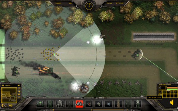
The brighter triangle represents the firing field-of-view for that soldier. Some units have 360, like mechs, but infantry can’t swivel their hips like that :D

Thoughts?


8 thoughts on Range Modifiers

  1. Looks great, maybe fade out the ‘added range’ or color it green? If you have a mod that reduces range/arc width but increases damage, then having the updated arc show in green, or maybe red, would show better that way.

  2. Looks good. On a small note, for me it’s a lot easier to grasp units of measure when they correspond to something I can get a visual idea of in game — games like LoL or DotA are bad at this (using hundreds of tiny “units” to measure what might be normal on-screen distances), whereas others like Supreme Commander and Starcraft use something reasonable in size (so i get an idea of how big something, say, 2.25 units is in the game world)

  3. What about animating the extended range out repeatedly to show that it is growing if you select this option? I also liked the idea of changing the color, but I would make it a subtle change.

  4. My experience with animated expanding effects like that are it’s harder to determine the exact maximum range if it’s endlessly pulsing. Even if I’m only supposed to make a qualitative judgement, I feel handicapped by it.

    Agreed about the difference between 370 move speed and 395 in LoL. If you require a grid for building, that’s a logical unit..

    How do you render those large circles so smoothly? I don’t see any hint of polygon edges..

  5. Oh yeah. I disagree with green or animation. Simple stuff that will help us grasp the game. Great!

  6. They are pretty high poly tri-strips, possible because only one is ever drawn at a time at that size :D

  7. I agree that there don’t have to be any animation or other fancy stuff, I find simple (but still nice looking) information is much more useful. There should be enough action and gratuitous effects from the ongoing battle anyway ,)

    I think you’re doing a lot of stuff right with you game design cliff. This is another blog entry where I have the feeling that here is a programmer that understands what makes gaming fun for me. I’m a big fan of upgrating and customizing units and other stuff in games, but it always bothers me when i’ve no idea whether the 10% range upgrate actually has any uses or not.

    With simple stuff like that, I can see that my upgrate makes my units for fire at that first tower and destroy it before running into the second tower and because of that they survive. Thats very important imo.

Comments are currently closed.