Game Design, Programming and running a one-man games business…

Stats Summary Window

I was looking at the conversion rate for the GSB demo (The percentage of demo downloaders who buy) and thinking I could find a way to improve it. One of the pieces of common feedback about the game was that people had no idea whether they had made good choices or bad in terms of ships and weapons.

Obviously there are all the ship and module stats and the post-battle stats, but I was thinking that it’s a bit much on the first playthrough, and that maybe something more simple was needed to give instant feedback. So I’ve coded a popup dialog on the stats screen that basically gives you four stats, based on the amount of hull damage that ships and modules do:
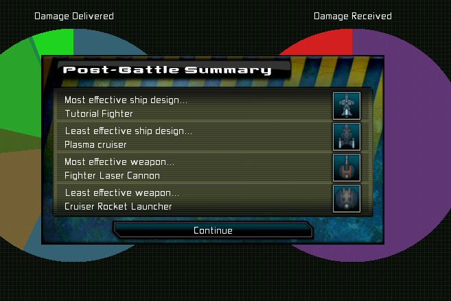
Thoughts? I know there are some people here who tried the demo but didn’t buy. Would this have helped ease you into things a bit?

This was a weekend diversion, I’m back on campaign bugs now…


27 thoughts on Stats Summary Window

  1. Definitly an improvement, are there numbers for the pie chart too so I can see if changes I make to the ship are improvements too?

  2. I hope you add this in to the full game, as I would like to have it. I don’t spend much time on the stats, but a simple display like this would be great.

    This would not have affected my buying decision – I played very little before buying, and by the time I knew stats etc were important, I had already paid.

  3. I would like this improvement alot as a casual GSB player it helps alot.

    Campaign wish list,
    Being able to right click and edit a ship hull design instead of sifting through the editor list.

  4. I am terrible at even basic math and not at all a numbers guy, so this dummy’s view is somewhat more helpful than pie charts and loads of stats.

    My confusion mostly is that there isn’t a clear upgrade path (and maybe that’s the point of the game, really, to experiment) without getting into the afore-mentioned numbers. It’s obvious that Module X II in most cases is more effective than Module X I, but when it comes to using pulse beams versus purple beams or whatnot I’m left a bit bewildered.

  5. This would have made me buy the game faster, rather than not being really convinced i would enjoy to invest enough in the game to make it fun. In the end, it was the steam collector edition sale that made me buy it, sorry.

    But since then I’ve bought the Nomads and Campaign through your site.

    And i’m really looking forward to updates to the campaign.

    Can i make a suggestion for the game? In the Challenges list, be able to save the sorting preferences when opening, exiting a challenge description.
    And also make it possible (via right-click) to directly download a challenge without having to open its details, and also not launch automatically the battle after download.

  6. I’d love this to be in the game as I find the stats pages a bit confusing, having a simple summary would be really handy.

    Also, on the pie chart page of the stats, it would be great if you could quickly deselect all except one ship and see the stats for that on its own. Maybe hold shift and click?

    Thanks for a great game! I purchased it ages ago, but have only really got into it properly after watching the TGN video on youtube.

  7. I bought the game, and many of the expansions, so I’m probably not the intended target for your question. I’ll put my two cents in anyway. :)

    A simple panel like this is a big improvement. I like the way it gives you some of the meta-analysis of your fleet. It’s not the raw numbers we’re interested in; it’s the relative measures. Which hull designs absorbed the most or least damage? Which weapons dealt the most or least damage?

    Two other suggestions that might help:

    1. Banish the pie charts! While pretty, they are widely known to be terrible at conveying quantitative data. It’s really hard for mere humans to judge the surface area of a pie wedge. Simple bar or line graphs are much easier to read at a glance.

    2. Consider overlaying the statistics on the deployment map. The positioning of your ships can be critical to the success or failure of a battle, but the stats page doesn’t help you evaluate this. The ship design may be effective, but its placement might be a tactical nightmare. I often find myself having to remember the name of a ship or several ships from the stats page, then cross-reference those names on the deployment screen to figure out if my cruisers or frigates were waltzing into a death trap.

  8. This looks like a really good idea to me: I can pour over the results but something this straightforward would give people a starting point for refinement, even if it risks being misleading in some cases. Even if a weapon was mounted on a ship that never got into optimal firing range (and thus was ineffective) it points in the general right direction.

  9. First congratulations for making such a great game cliffski :)

    I think the summary window a good idea that can help new players that don’t like digging into the stats.

    I also agree with Bandsaw:

    “Also, on the pie chart page of the stats, it would be great if you could quickly deselect all except one ship and see the stats for that on its own. Maybe hold shift and click?”

    This would be so helpful, it’s propably the most annoying part of the game that you have to deselect all ships/weapons everytime just to see one specific stat.

  10. No worries, Cliff. Overlaying the stats on the deployment screen would be a major change. Perhaps something for a gold edition of GSB or a GSB2!

    But as long as I’m dreaming, once you had the stats on the deployment screen, you could show the flight path of capital ships, with key events marked along the timeline. Shields down, armor pierced, engine failure, etc. The eventual fate of the ship could be marked with a red X or green circle. It’d be a great visual way of summarizing what happened during the battle.

    A display like that might also help player evaluate whether certain orders were having the desired effects. “Wait a sec, why did that cruiser chase enemy frigates instead of…?”

    I wonder if there’s a simpler/easier to program way to help players figure these things out?

    The three major decisions players make in GSB are:
    1. The type of ships to use
    2. The placement of those ships
    3. The orders given to those ships

    The current stats screen really only helps with #1. Closing the feedback loops on #2 and #3 would help players discover that their decisions matter.

    It was a big “aha!” moment for me when I discovered that I could equip a capital ship with long-range weaponry and order it to engage the enemy at a distance.

  11. The possibility that the tutorial fleet might be better than anything I’ve designed scares me.

    Also, EMP doesn’t do damage I think so be careful about saying that the EMP frigates are the worst in a battle!

  12. Hm.
    Nice.
    Achievements are similar to this.
    “Beat two fleets with just lasers.”

    Also the statement with the “clear upgrade path” is convincing.
    “Your plasma torpedos would have been a good idea if the enemy would have stood still.”

  13. This would help a lot. The data is often overwhelming.

    Also, I dislike pie charts and would prefer bar charts.

  14. Just to add my two cents worth, I don’t care about the stats, I would like *suggestions* on how to improve. Like:

    Least Effective Weapon:
    xxx

    Suggestion:
    Try using yyy instead because zzz shields are vulnerable to aaa.

    Keep up the fantastic work!

  15. Something simple like this would be brilliant! Maybe even an ordered list of most effective -> least effective, or something. But this alone would definitely be handy. I’m starting to finally feel like I know what I’m doing, but it’s still pretty confusing.

    I don’t know if there’s already a shortcut for it, but often in the stats window I want to be able to show stats for one type of ship. Maybe right-clicking or ctrl-clicking a ship icon shows only that type?

  16. I’m all for this! One of the reasons I grew apathetic after I got vanilla GSB was I began to realize that my ‘more informed’ decisions after beating a few levels seemed to be making my fleet LESS effective. Or that’s what I felt, at least.

  17. Yes! I find it rather difficult to make use of the pie charts to be honest, but this I can see being very useful.

  18. Awesome, this might even make me buy the game. I’m just not that big of a numbers guy so this will definitely help a lot. Something that would be interesting is an overall stats page for the player based on every game played. Show which ship was used most, which dealt the most dmg etc. just like this only for all games, last 30 games, last 10 games, or last 3 weeks, etc. Just a thought. Great improvement anyways,imo.

  19. This is very useful! I experienced exactly what you described in your post when I first played GSB. I loved the onscreen chaos, but didn’t really know which ships I built were good and which were bad.

  20. yes, to break out of gun vs missiles, ship types is great. but only after playing it awhile.
    do not know if demo player reaches that level before buyng or not.
    How long or times does the demo get played before buying ?

  21. This isn’t in the version I bought. It’s bullshit that you are no longe rupdating and supporting a game you sell, instead selling that same game again with slight modification and calling it it’s own thing. What you’re doing is selling half a game and then telling the kids that could only afford to buy the first half they can’t join in any of the games because they couldn’t pony up $30 for your pet project.

  22. This is in the latest FREE patch that is FREE for EVERYONE.
    but enjoy your whining kid…

    I am releasing patch 51 today. 51 patches, ALL FREE.

    *SIGH*

Comments are currently closed.