It’s pretty clear from the tons of great feedback I got that GSB has an initial-learning curve and usability problem regarding designing ships and seeing the effects of them. I’ve already been trying to address this with adding damage feedback indicators to the game (see here). I think that will make a big difference. It’s also clear that the ship design screen could do with some work. One of the ‘improvements’ has been there for ages, but it’s not very well promoted, so you might have missed it. And if you played the original beta or demo, it wasn’t there, and you really should try it again:
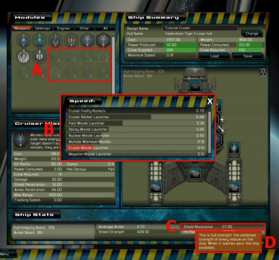
Here is a screenshot showing recent changes:

A) Shows that a lot more modules are now locked at the start of the game. People found the choice overwhelming, and to be honest, you aren’t going to absolutely need an EMP gun or light plasma launchers to beat the tutorial, so they are now locked. When the game patches, it will now lock those modules, but existing players will have plenty of surplus honor to re-unlock them right away. This should make things look less scary for people trying the demo or just starting out.
B) Is the feature that has been in for ages but isn’t well known. Its the module-comparison dialog. Clicking any line of data about the selected module will open this window, with a sorted list of every module with that attribute, and highlight where the current module stands. Great for working out whether this modules missile speed (jnt his case) is slow or fast relative to other module choices. This feature is really handy. Its also launchable from other screens where the same module data is visible, like the unlocking screen.
C) Is a new item on this ‘ship stats’ window at the bottom. (In lower res layouts, this is a seperate pop-up window launched by a button in the corner of the blueprint). This shows shield resistance, as well as strength. These are very different things, and you may want to pritoritize resistance over strength, in some cases.
D) Tooltips! These explain those stats, which are probably confusing everyone. This stuff is in the manual, and hinted at in the tooltips for module data, but it’s much more useful to have it here, when you can see those numbers next to the design that they apply to.
This isn’t the end of usability improvements, I aim to add a bunch more, although they will probably be quite minor, and relate to tutorial windows and so on. Hopefully, by the time the next patch (1.41) goes out, the game will be far more attractive to new players. I’m kind of playing a ‘long game’ with GSB. I normally move on to the next game quicker than this, but I love working on GSB and I’d like the game to reach its full potential.