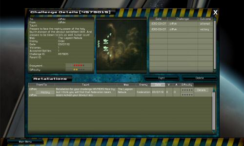
This isn’t finished yet, so this is just a work in progress screenshot, click it to enlarge…

This is new challenge UI stuff. I got sick of squeezing more columns in 1024 res on the list view, so now those download and delete buttons get replaced by ‘details’ which opens this new screen for a selected challenge. All the old data is here, with room for some more, and the history of that challenge is now auto-downloaded and displayed here at the top right. You can also now see the challenge ID in the titlebar, (I’ll probably add that to the list somehow too). there are two super-exciting new things:
- The challenges now uplaod a screenshot of their deployment, as you can see. Obviously old challenges will not have one, but new ones will. I’m very happy about this :D
- The challenges now have a parent, because when you win a challenge, you can send your fleet back as a ‘retaliation’. These get listed like any other challenge, but if you pick one of your challenges, you can see a list of it’s retaliations on the bottom window. I don’t have a super-threading view of it all, but this is a first step.
My plan for this is that
- Players will be able to see what a challenge looks like before downloading, which helps detect ‘spammy’ fleets for people who prefer not to play against them
- There will be a more on-going to-and-fro between players over who has the best fleet, using retaliations.
I still have more tweaks, and a ton of testing to do, to make this work well. I’m hoping the next patch will really improve the online stuff. Ideas and feedback are most welcome, as ever.