I was honestly trying to work on new DLC, but hey, I ended up adding and improving some stuff. One thing I ended up doing was mouse cursor changes, so it actually changes to the windows pointy finger thing now to show you that you can click something, which is quite nifty. I also added two features.
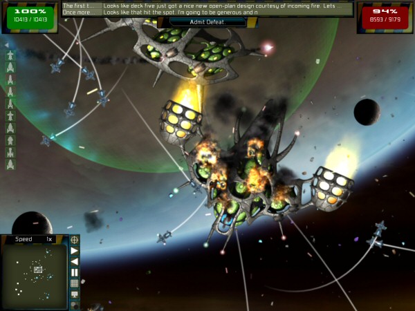
The first feature is the ‘fleet overlay’ at the left of the screen. It’s a scrollable column of icons for every ship in the fleet. The tooltips show your current damage percentage, and they fill red as the ships take damage. you can also click them to zoom to that ship. It’s a handy way to see at a glance in big battles which ships are taking hits. I also added a tiny arrow icon to toggle that new feature on or off, in case some people don’t like it. I have a tiny UV bleeding issue on that button I must fix…

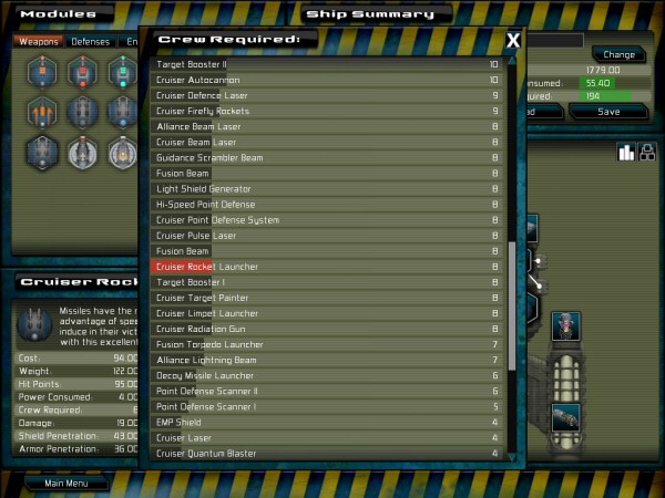
The second feature is rather cool for statistics-freaks. If you have played much GSB, and spent much time on the ship design screen, you will know the frustration of seeing “weight=122” and not really knowing how that compares to anything else. Obviously you can go through each module of the same ship class and compare, but wouldn’t it be better if the game makes that trivial to do?
Tada! It does. You can click any of those data entries at the bottom left now, and get a comparison window, ready sorted and scrolled to show where the current module fits in. I hope people find this useful.

Now I can get back to work designing fleets for the religious aliens in the next DLC…
Both these spangly new things will be in version 1.32, which will get released shortly before the new DLC. Yay!