Game Design, Programming and running a one-man games business…

RangeFinder

In my play testing and balancing sessions, I found myself really wanting to know what the ranges were of a specific weapon mid-battle. You get to see this in pre-battle deployment, but that’s only the initial formation. There is nothing more frustrating than watching your ship sit there, minding its own business while an enemy ship sits just out of range and missiles it to pieces :D I should adjust the ‘retaliate’ AI order to allow it to move within range

So anyway, I’ve added in a new range-display GUI to the battles. Basically you just click on your ship to show the window with its details, then click a module with a turret on that window for it to highlight that weapons range on the map. I’ve toggled on the background grid here for extra ‘tactical display mode’ fun.
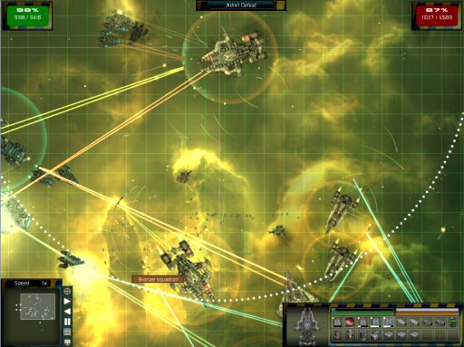
The last few days have been really hard work battling an obscure texture corruption bug. I was working on it at 1AM last night. I’ve completely rewritten my vertex buffer code to use a different locking strategy, and I’m pretty sure it’s for the better, although I do too much memory copying for my liking. Still, the game runs pretty fast even so.


6 thoughts on RangeFinder

  1. I think that’s a good idea considering the player is commander of a futuristic fleet of gigantic space shapes – a range indication would be a highly likely feature of the command user interface. :)

    Hope you get some rest this weekend – working till 1am a lot will burn you out. ;)

  2. I always enjoy range displays – and they’re pretty key to most tower defense games (Defense Grid does this pretty well).

    And this is just a random thought, inspired by the dotted line on the screenshot. Perhaps instead of clicking on one module, a ship could display all its modules’ ranges simultaneously? You could make each type of weapon have a distinct range outline (e.g. dotted line for missiles, solid line for lasers, etc.) so it would be easy to see a ship’s entire sphere (er, circle) of influence.

    This worked really well in Battleships Forever, though that one’s much more RTS tactics-focused and less visually “busy” than GSB, so it might be superfluous or even distracting here. Just a thought, though.

    I also love the new background – interstellar dust pillars always make for good visuals. The green tint is a nice change of pace, too.

  3. I really like where this game is headed. And the range finder is a great idea. Just don’t stray off course. The AI fleet battles should have as little interactivity as possible.

  4. With that Grid on it looks like MoO2’s tactical battles. … Damn, now I want an optional turnbased version of GSB SO BADLY.

  5. Wow, that does look really nice Cliff! I think those range bubbles as I will call them are really good and will make it easier to know where to position your ships.

    As amishmonster said it would be nice to have all weapons on a ship show their range, that would be good.

Comments are currently closed.