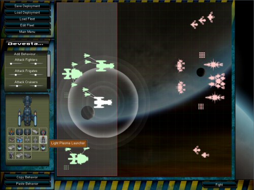
Ok, so here is the current (and close to final) layout of the fleet deployment screen (click to enlarge). The new thing that has gone in, and was a long time coming (apart from some UI tidyups, and better support for the range of possible screen resolutions), is individually highlighting weapon ranges.
You can see that I’ve moused-over one of the icons for this ships modules (Light Plasma Launcher), and the range of that weapon from the ship is shown as a bright white circle around it. The faded out circles represent the ranges of this ships other weapons, and by mousing over them, I can see which is which. This will make positioning ships better much easier, and will remind you what ships are suited to particular roles.

One thing that isn’t done is offsetting those ranges to take into account the modules placement on the ship. It will not make a big difference, but maybe it’s worth doing. For the big ships on small maps, it’s probably worth putting certain weapons at the front.