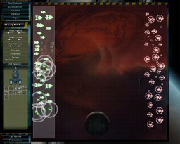
I’ve just made a change to the games deployment-screen UI, so I thought I might as well share it’s current look: (click to enlarge)

I used to have an icon ‘picker’ on the right hand side when you loaded an un-deployed fleet, and you had to drag and drop the ships into position on the left hand side. This was a bodge and tedious with huge fleets and big monitors.
Now the game will auto-deploy the fleet as you load it, and then you can slide them around and fine tune it. This is the same sort of system used by the Total War games, and I think it works much better. I’ve spent a few days working on some heavy duty re-organising of code for it to render faster, and things are much much more efficient now. Even with bazillions fo ships and things going zap everywhere, it seems to run pretty well. My next big challenge is getting it to run on my laptop…
Any thoughts on the design?