Game Design, Programming and running a one-man games business…

Dissecting my own design. The Gratuitous Tank Battles GUI

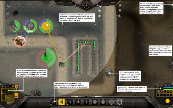
Nothing in life is perfect. Not even sheldon cooper. So it’s always worth taking a fresh look at stuff you have made and trying to tear it to piece and criticise the hell out of it. Fortunately, the internet is full of people, ‘professional’ or amateur who will tell you your game sucks, but often not in especially helpful ways, so I’m trying to tear my own game to shreds and find everything I can to criticise and improve. So I present to you my initial thoughts on everything that is rubbish about the GTB interface for battles (and obviously this acts as a todo list for the next patch…) Click the image below to enlarge

Let me know if you think of other stuff in the battle GUI (or any part of the game) that is unclear, confusing, or could be improved.


10 thoughts on Dissecting my own design. The Gratuitous Tank Battles GUI

  1. I haven’t had time to test GTB yet so I have no idea if it fits the design or if there’s already something like this already in place, but that disclaimer aside:

    A simple solution for showing turret effectiveness would be to add ranks for units. A unit would get ranks for killing units, assisting in killing units or dealing damage (you’d probably have to test to figure out what works best), and you could show small military rank chevrons to show its rank.

    A unit could get a small stat boost from ranks, or it could be simply a visual indicator, whatever works for the design.

  2. My biggest gripe about both the GSB and GTB UIs: the tool tips have too long of a delay. I feel like I’m waiting forever for the tool tip to show up, and moving off of it to another item with a tool tip (seems to) reset the timer so that I have to wait again for the next item.

  3. Judging by the demo, I actually find the battle UI quite straightforward, but the design UI is a nightmare. I never know what design I’m currently editing, how to create a new design, and why can’t I just browse through the units in a normal way, not through a dropdown list with just text, no icons and lotsa scrolling… Especially at the beginning of the game this is disheartening, because I only know units from icons (I don’t remember all those shnazzy-prazzy names). Also multiple times I saved a design with the old description, or forgot to change the name overwriting a random old design…

  4. Hey thanks, the diea of adding icons on the design list is an excellent idea, and one that I just stupidly have not thought of myself :D

    The tooltip delay is a tricky one, if tooltips are too quick, then can flash on and fof when you are just mousing around, which can be annoying, but I may have erred on the side of slowness. Any specific tooltips are too slow?

    The problem I’d have with ranks for turrets is people would assume they made a big gameplay difference, and I think that might change the game way too much :(

  5. Just played the Demo and made a few quick observations:

    * It would be great if there were Next/Previous buttons on the tutorial text boxes.

    * When the blue tip boxes appear in the upper right corner, their exit button is sometimes covered by the Supplies GUI element.

    * It seems there is almost too much information to make informed choices at first. I can’t possibly compare all details of all units in the first tutorial level, or begin to analyse the strategic advantages of each one against an unknown number and mix of enemy units. Maybe there should be fewer units (both for the player and for the enemy) to begin with, to avoid the ‘stack of doom’ strategy I felt I had to resort to, where I simply try to get at least one of each type of unit, knowing that each is effective against ‘something’.

    * There could be an alert whenever one of my units are destroyed, so I can replace it with a new one.

    Oh, and I found a few typos:

    * In the tutorial text on Supplies, “attackers” should be “attacker’s” in the following line: “An attackers supplies stop arriving when the timer runs out.”

    * On the Victory Screen, “kase kuchen” should be “Käsekuchen.”

    I know how tricky interface design can be, and that it can involve a lot of trade-offs, but I hope you find these observations useful. Overall I thought it was fun and fairly intuitive to play the demo!

  6. Add number of shots, number of kills to a turret; display either has a hovering text, or a tool tip on mouse over or to the display when it is selected. Or all three and make the display configurable.

  7. Totally agree about getting actual unit info mid-battle. I don’t have as much time to play this game as I’d like, and when I do I really want to get right into the battles but I’ve found myself constantly feeling under-educated about which units to pick in a pinch. If there was a better way to access the level of detail you have in the customization screens mid-battle I would love that (particularly if it’s made as easily accessible at a quick glance as possible).

    Thanks for the great game, by the way!

  8. I purchased the game, just tried 4 campaigns 1.008.

    Interesting game, but feel bored very quickly maybe I haven’t try design section yet.

    While it is fun in the beginning, feeling missing some “WOW” factors at least for the fist 4 campaigns.

    I try to compare to the best 2 tower defense games I ever played, probably we can get some inspirations – Plant vs zombies has “Final wave” excitement and clear unique plants, Defend Grid has bosses / increasing intense of ending fight and very exciting tower upgrades.

    what I remember is GTB’s AI enemy waves start small, then increase then at the end reduce again. ( When I play attacker I also experience the same, first I have no money then I gain money and employ more troops, but I expense too much and have a slow ending – probably I am not expert attacker)

    Probably cliff can consider below:

    1) I remember GTB has a timeline in each game, divide the time line into 3 phases: Phase 1 income generation X1, phase2 X2, phase3 X3 meaning that if you destroy 1 tank / tower towards the end, you get the 3 times money, this create a lot of excitements towards the end and some good potential turnover on winning side. Create a simple nice sound effect / music change or visual indication for entering each phases.

    2) Not sure GTB has bosses or planning to have. What I remember in 1.008 is we have Armor / Shield / infantry all walking slowly in a little overwhelming way. My thought is we could have more options very fast unit / stealth unit / “adhoc repair spell” / as well as ~2 mega / bosses technology for both sides, Attacker: either 1 slow and aggressive Giant Mech – “G-1000 King Cyclops?” or a Defensive “T-97 Carrier Tank” that carry lots of tanks / mech insides”
    Defender: either ” a V5 Super Cannon” with slow loading time and huge area damage or a Mega Factory that produce basic tanks / mech quickly in a reverse path to counter attacker

    Well it is just my suggestions based on the my 3 days experience with 1.008 version. It might be very hard to implement for a pain in game play consideration etc, but GTB could be even better with some excitement infused in.

  9. “”Hey thanks, the diea of adding icons on the design list is an excellent idea, and one that I just stupidly have not thought of myself :D””

    I suggested something similar on 30th April. But just using the division manager:
    http://positech.co.uk/forums/phpBB3/viewtopic.php?f=32&t=7276

    So how many game releases before we get folders for those unit types? (Turret, Tank, Mech, Infantry), (Per race folders for GSB).

    I don’t see how the mess of the ever growing list of unit designs for GTB is acceptable. The release of DLC (and mods) will only make it worse.

Comments are currently closed.