Red buttons are NOT better than blue buttons. I have hard data for my gratuitous space battles index page demo button:

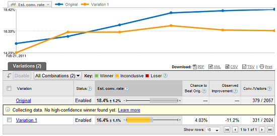
In fact they are much worse:
original
variation
Nothing beats hard data. Extrapolating from this is probably less helpful, given that my page is mostly blue so it might have ‘jarred’ but I had guessed that might be a good thing. it wasn’t.
These stats, I’m interested, do you see much difference if you change nothing?
@Garry he changed the Download Demo button color, check the page more below
What about the fact that you made the red button text off center and therefore less appealing? I would not say this is a valid test.
I love all these experiments that you’re doing and thanks for sharing your results. Have you tried moving the demo button above the fold?
As Simon says, you definitely need a download button above the fold. Once you’ve tested that to your desired degree of statistical significance you may the want to try a puncture red button (the button doesn’t really stand out in red as you had it) and/or a green button (as green is one of the main colours people expect to see for download buttons.)
Damn iOS typo correction/addition (usually addition, sadly): where I seem to have said ‘puncture’ a meant punchier.
At what point on the graph exactly did you switch to the Red Button? And how did the two graphs compare before the switch?
You might want to test the download button with a dark background versus a bright blackground. To me the red one is brighter and i need to squint a bit to reach as clear a visual focus as the blue one gives me when just looking normally.
I’m red/blue colorblind, you insensitive clod!
What would be uber-cool, cliff, is if you could have a row of buttons along the top of the page that you could click on to ‘choose your side’ and the graphics and colours would change to faction colours and ships. It could probably be done reasonably easily with CSS.
Aww, shame.
Thanks for sharing the results though! I wonder why Red outperformed Green on that other survey…
@David – I understand that – what I’m getting at is.. where’s the control? Would the stats be noticeably different if you changed nothing and sampled 2 random groups exactly the same.
My impression is that the red coontrasts too much. In the context of the calm, blue site it seems sort of scary and negative.
Small sample size, short time period and even the tool you’re using suggests the data is inconclusive at this point – not really ‘hard data’.
I dig what you’re trying to do, it just seems like all you’ve really determined at this point is ‘changing stuff might give different conversion rates, perhaps.’
well it makes me happy.
Not meaning to sound flippant because I didn’t actual see the red button but have you compared blue to orange?
Orange might have the right tones for visual and psychological aesthetics
Plus it’s different enough to the rest of your theme to stand out